|
|
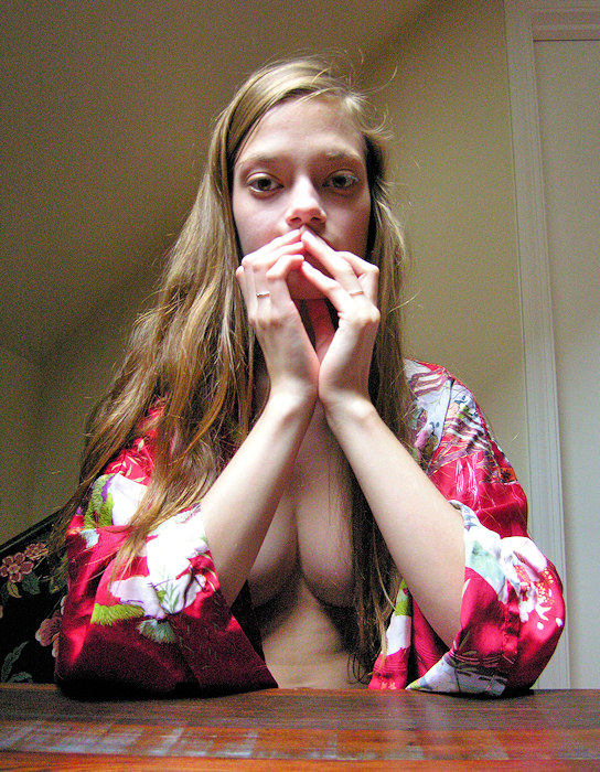
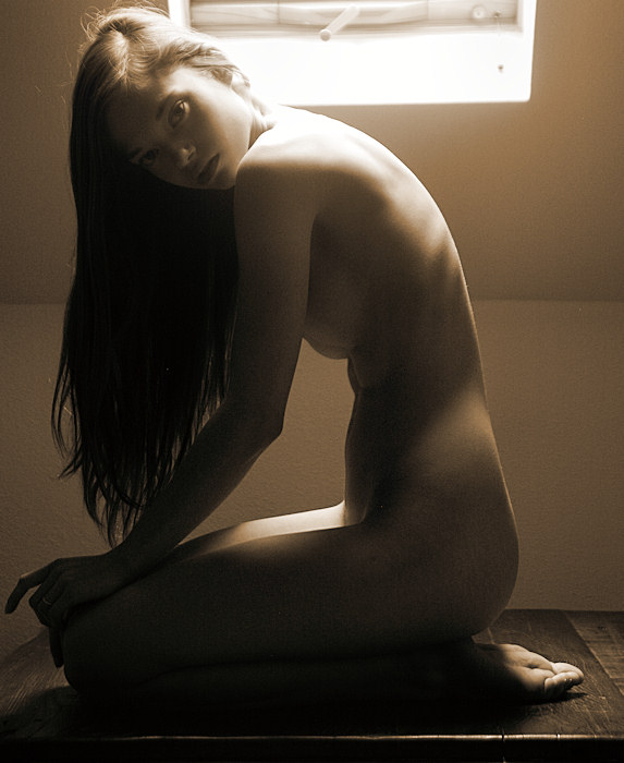
The top floor
of my house is a finished attic. Hence, the exterior
north & south walls are only ~four feet tall, then the
walls slant roughly 45° up to a normal height ceiling.
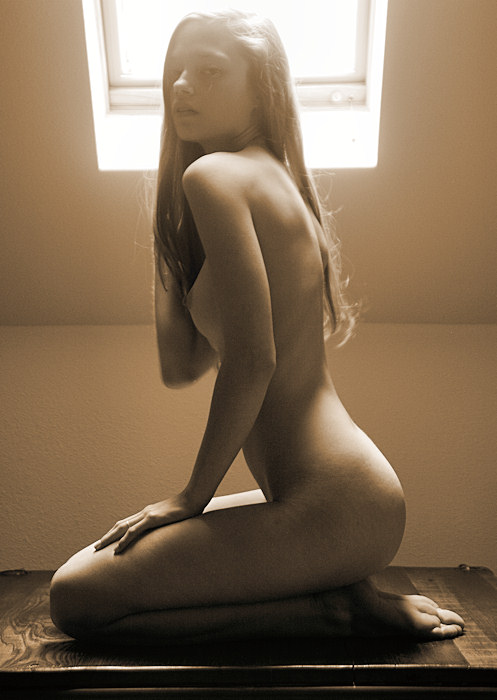
At the top of the back stairs is the guest room. On
the north side is a lovely table made of recovered barn
wood placed under a modest sized skylight. Here we
are at the table; you can see the door to the back stairs
over Ryonen's left shoulder. On the other side of
the room is the guest bed,
where I photographed
Natalia the last time she was here.
In any
case, here we pause for a little water & cracker break.
I leave the DSLR alone, but I do bring out my point &
shoot camera -- it's wide angle lens works well in this
tight space.
In retrospect,
I feel a little bad about making photographs during Ryonen's
break. A break is a break -- she shouldn't have to
worry about a camera while she's taking a break.
|
|
|
|
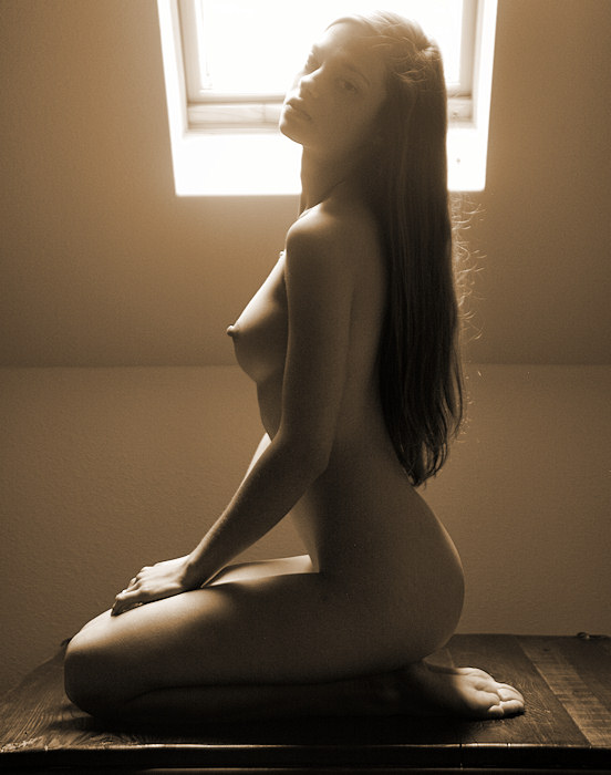
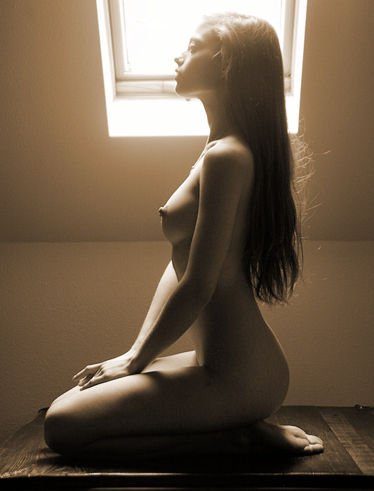
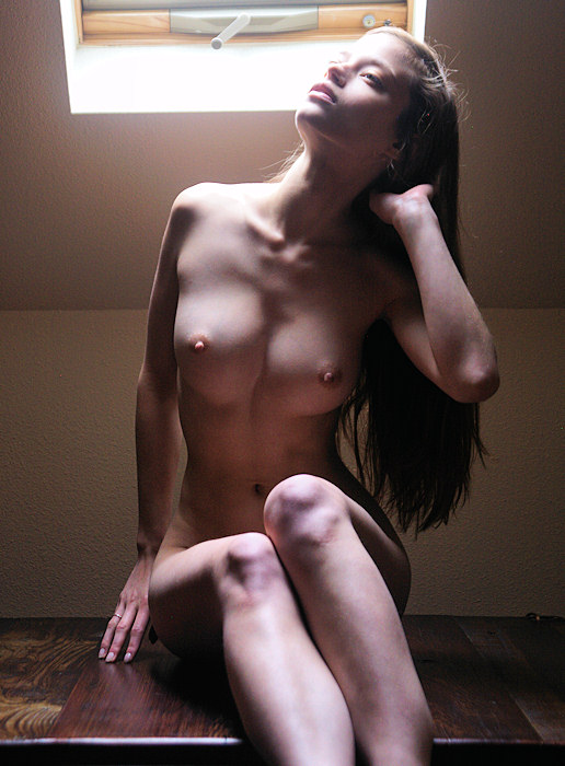
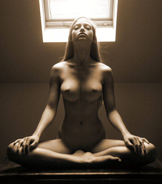
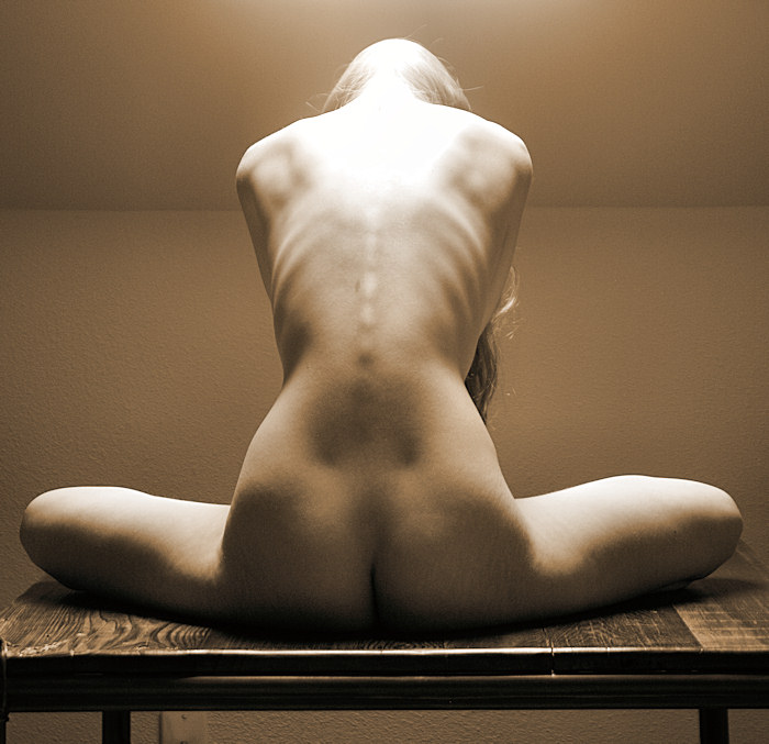
When the break
was over, Ryonen asks if she could pose on top of the table,
and I agreed. We made these exposures during the summer
months, and the sun was high in the sky. Although
there wasn't any direct sunlight coming through that north
facing skylight, there was a lot of light drifting downward.
We couldn't make any decent exposures here during the winter
months, but now, we had some interesting light.
I think
I'll focus on the sepia-toned versions here. This
kind of light tends to bleed off the color anyhow.
Right
off the bat, we made some lovely images.
|
|
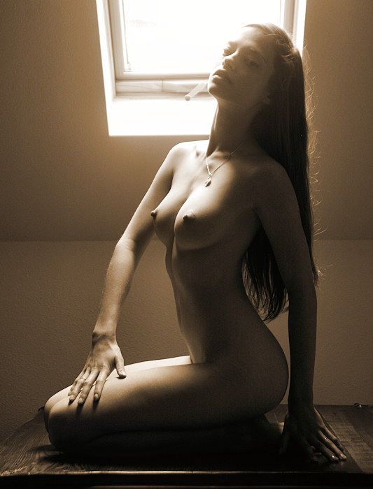
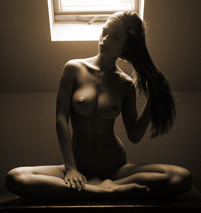
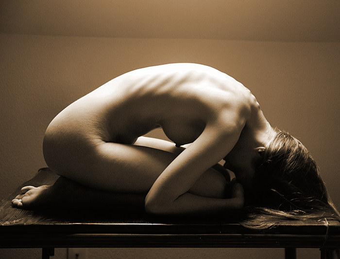
Okay -- here
is a token color image -- you can see that the colors are
naturally desatuated. I figure that if the color isn't
making a contribution, I'd prefer the sepia toned images.
Lately, I find that prefer to reduce the information in
an image to the bare minimum.
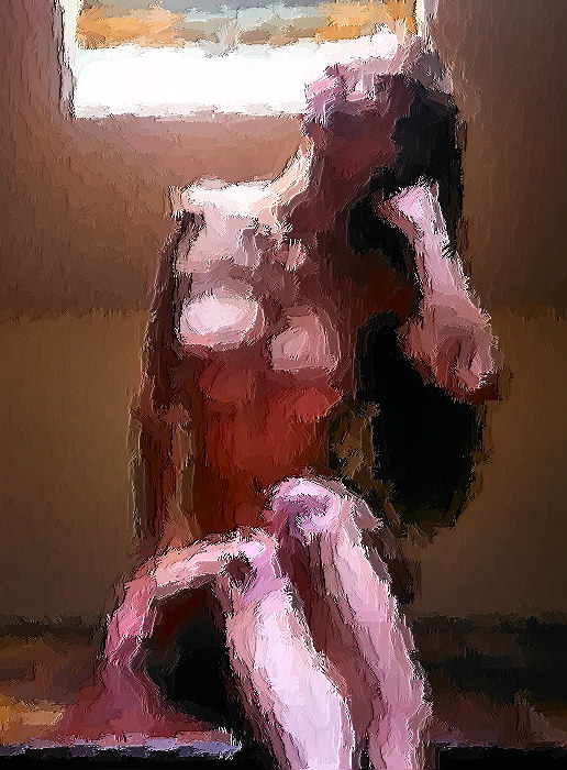
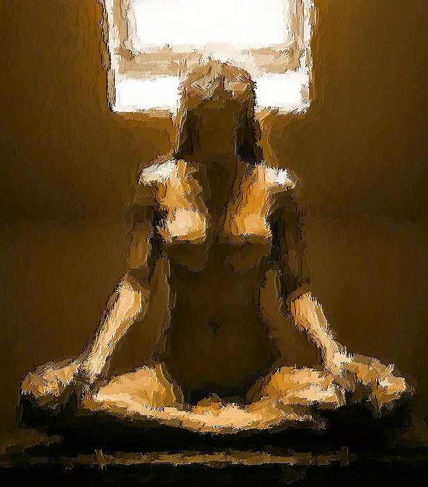
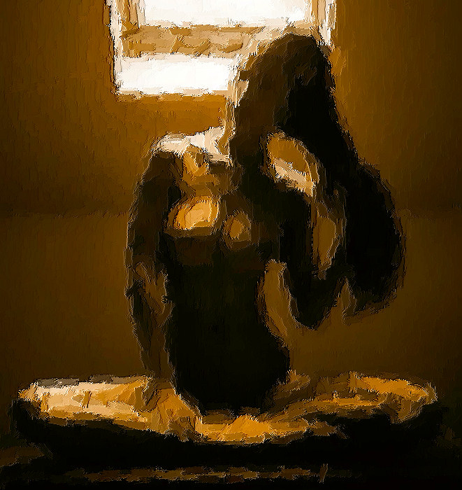
Speaking
of which, below is the "artistic effect" paint
brush version of this image -- it includes more color saturation.
The brush strokes reduce the information, yet our brains
can still recognize the image.
There's
something about this image that speaks to Ryonen's youthful
vitality. That's why I like it.
|
|
|
|
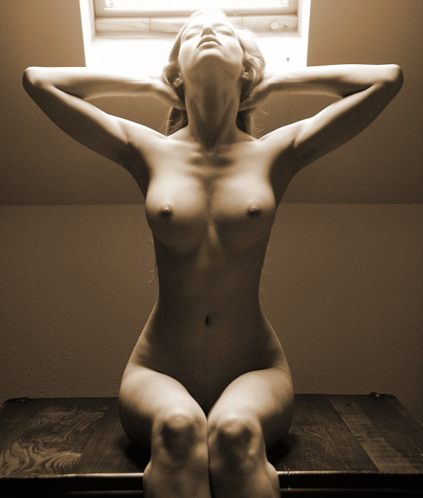
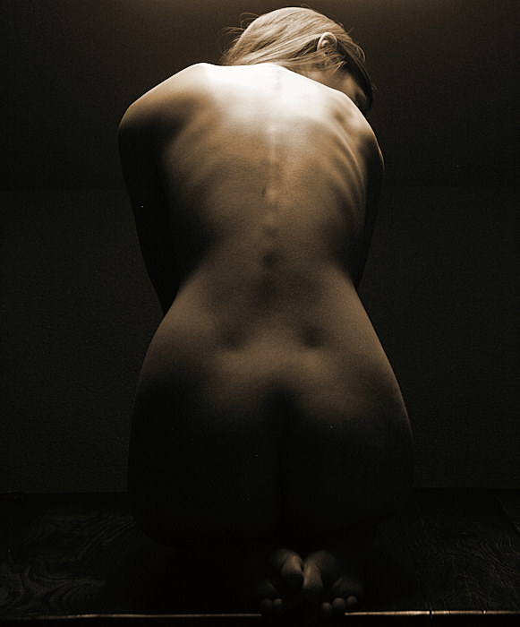
If you are like me, you look at lots &
lots of images. I tend to "deconstruct"
the images; I ask myself...
- Do I like the image? Why or why not?
- How was the image lit?
- What would I do the same?
- What would I do differently?
- and so forth.
Lots of beginner (and advanced) photographers enjoy lighting
nudes with one bright light source, producing an image of
light & shadow, typically with a black background (and,
yes, I've made my share of these one-light images).
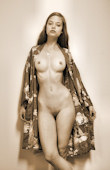
In general, I don't like these images.
This image here, a favorite, almost qualifies as
a "one light" image, but there are some key differences.
Most importantly (to me): there is a tonal separation
between Ryonen's contours and the background -- you can
see Ryonen's figure clearly defined on all sides.
That I like. It's a subtle thing, but to me,
it's vital.
|
|