|
|
|
Okay -- the observant
visitors will notice a significant gap in the creation
of the previous page to this page. I'll blame
another distraction. My sister & I own & manage my
father's music publishing catalog, and I use an advanced
& elaborate spreadsheet to calculate royalties for our
writers & co-publishers. As part of my estate
planning, I was determined to do a major revision to
this tool and to document how to use it, so that my
sister could take it over if I'm not capable. I've
tried 3 or 4 times to document how to use the
spreadsheet, and managing music royalties is very, very
complex. But I've been able to complete this major
revision & documentation process. (I also think
that creating a good & usable spreadsheet is an unnamed
art form, and I'm excited to think that the spreadsheet
will get viewed by someone other than me).
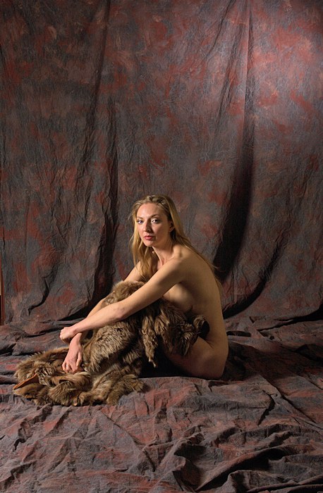
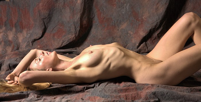
In any case, when we were
creating the "Studio Shadows" images (shown on the
previous page), I didn't get the
sense that we were making progress. In retrospect,
we did create some images that I like a lot, but I
didn't feel that way in the moment. So, we changed
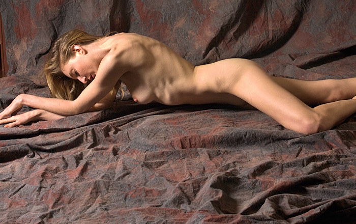
things up a bit. I pulled out my favorite
backdrop, adjusted the main light so that it wasn't
coming from behind as much, and put Tiana on the floor.
I do like this light.
|
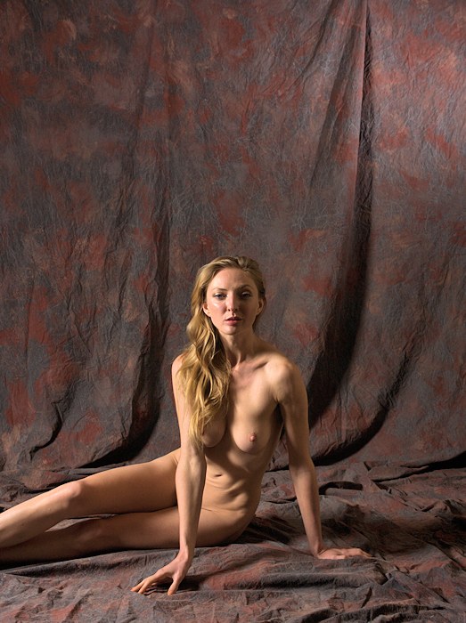
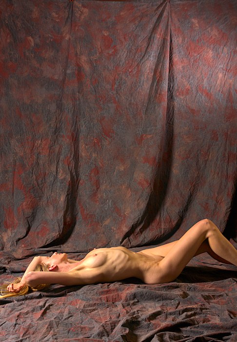
I don't ask
models to lie down often enough -- I do like what being
horizontal does to a figure, and Tiana always looks
exceptionally terrific in such poses. She is
always fit, and I do like the definition in her ribs &
belly & hips.
I'm also a fan of off-center
compositions. I like putting Tiana along the
bottom of the image & balancing the image our subtly
with the warm highlight on the backdrop in the upper
right corner.
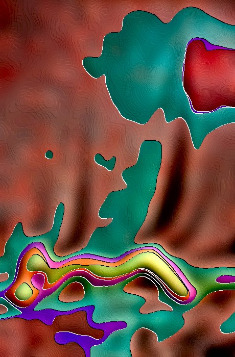
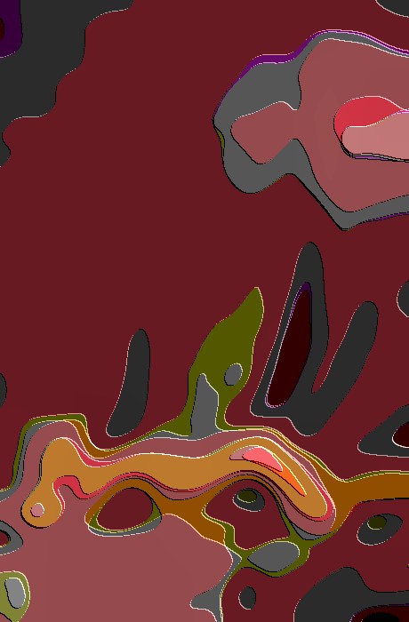
Below are some artistic variations,
based on this image: |
|
|
|
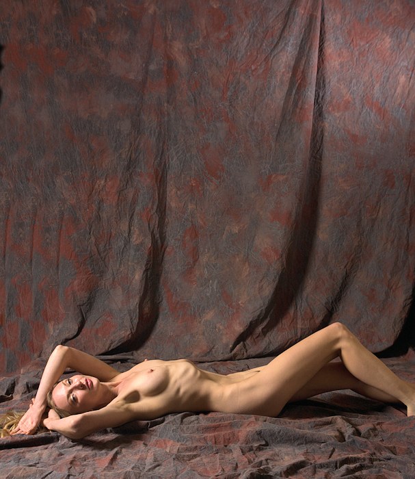
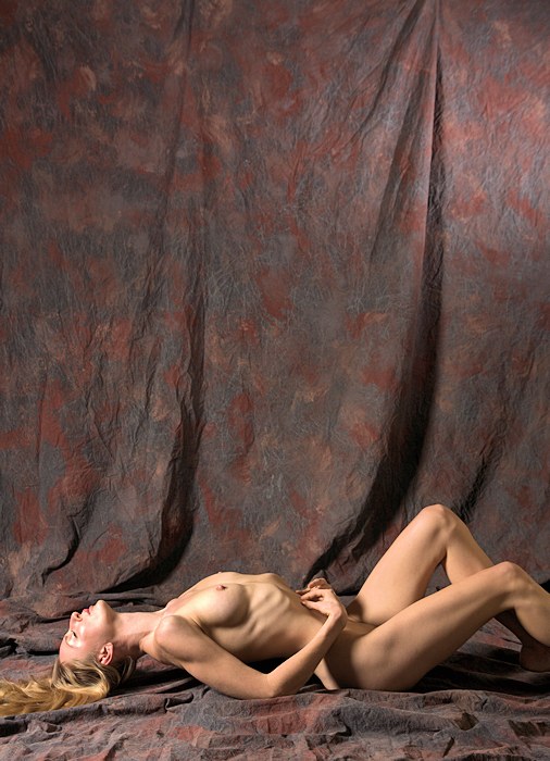
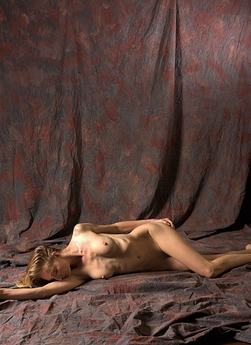
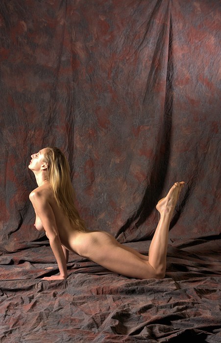
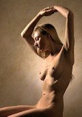
I am a fan
of off-center compositions. It gets tedious
viewing images where the subject of interest is dead
center -- I like giving the viewer's eyes a workout.
While I like the "weight" of the backdrop above Tiana, I
think this composition is a little bit forced.
It's a bit unbalanced -- there is not much of interest
at the top of the image, even if that interest is
negative space. |
|
|
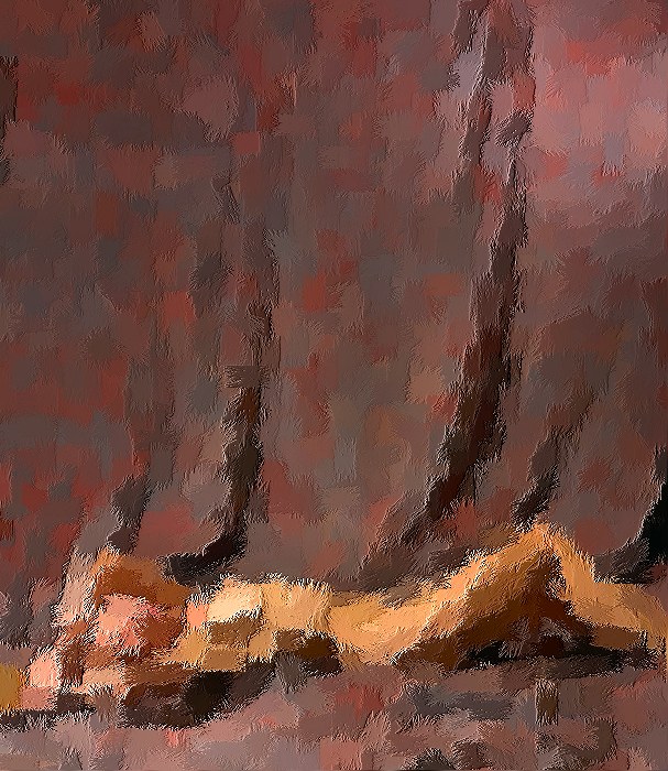
I am not
real happy with the technical aspects of these images.
Specifically, I think the exposure is off a bit -- the
highlights (the lightest areas of Tiana's skin) are a
bit blown out. Further, the colors have become
bland -- I'm finding that if the exposure is off just a
bit, the color saturation is off.
For this image,
I've increased the color saturation to compensate.
It helps, but those highlights are still blown out. |
|
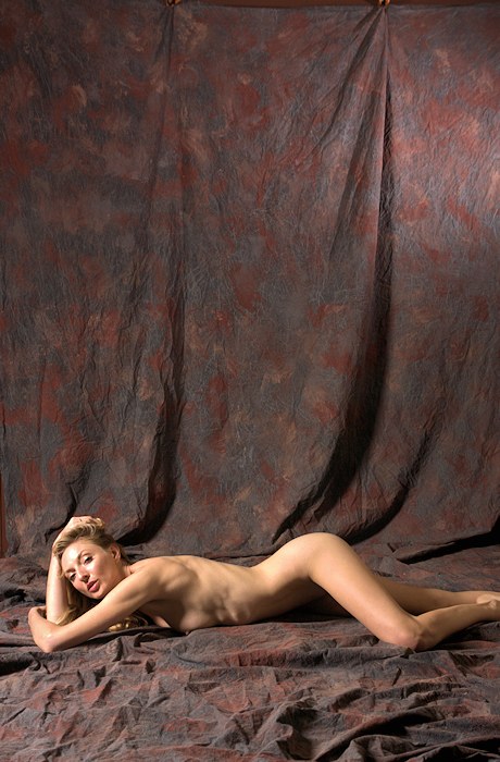
| Okay, this
image gives me an idea about why the other images bother
me a bit -- in the other images, I cut off Tiana's feet,
and here, everything is included. Further, the
blown out highlights (on Tiana's face) are pretty
obvious.
|
|
|
|
| Tiana is,
hands down, one of the best models I've had the pleasure
of photographing. Moreover, she is sweet, smart,
and very easy to be around. But sadly, I fell
short this time -- my technical controls weren't tight
enough, and I was too distracted by real world concerns
to give this session my best efforts. Still, there
are a few good images from this session, so I'm happy. |
|