|
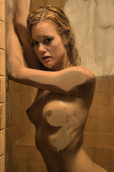
I do enjoy working
in my steam room. It is a logistical challenge --
the space is cramped, the exposure calculation is
tricky, keeping the equipment dry & safe is difficult,
and it's difficult to find places for the lights, the
camera, and me. In addition, with the steam room
door closed & the water running, it's difficult for the
model & me to communicate with each other.
On the
other hand, the images we create tend to be very
abstract & evocative. Like this. This is the
two of us just getting started. |
|
|
|
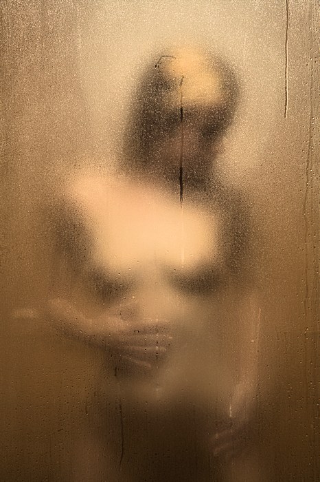
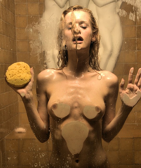
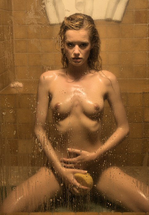
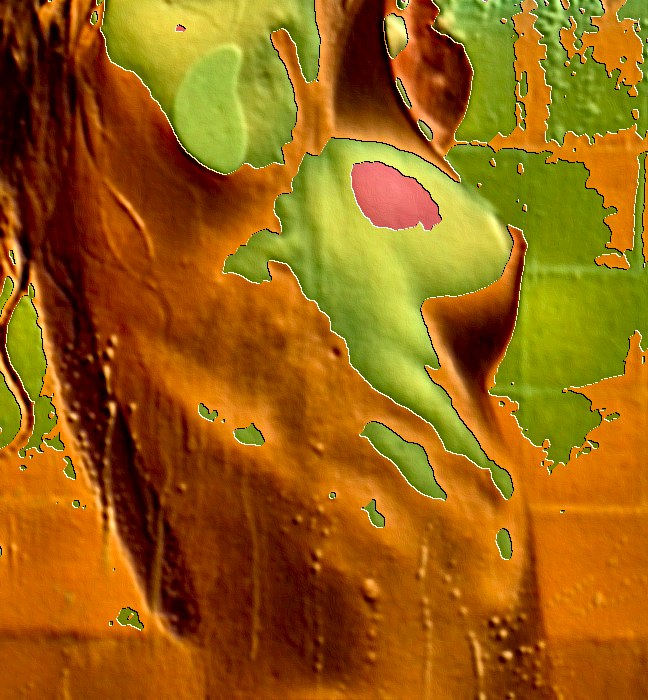
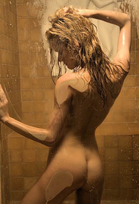
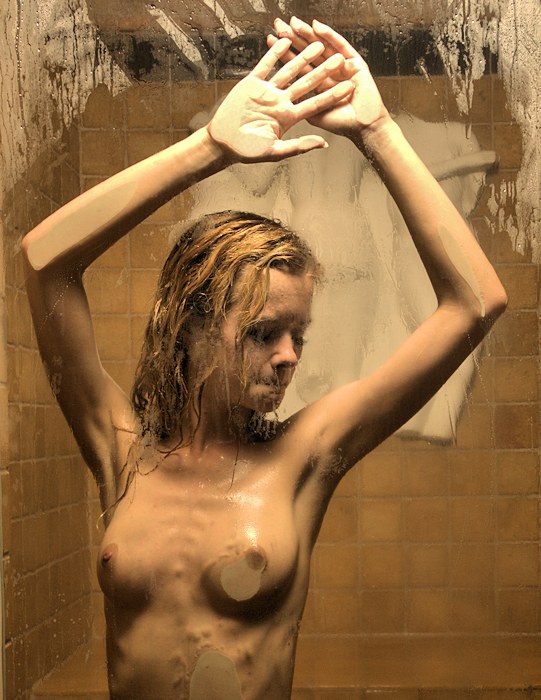
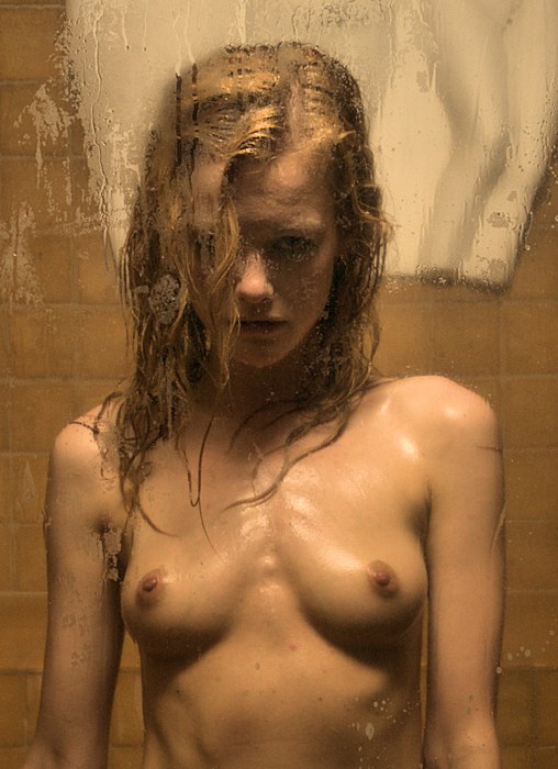
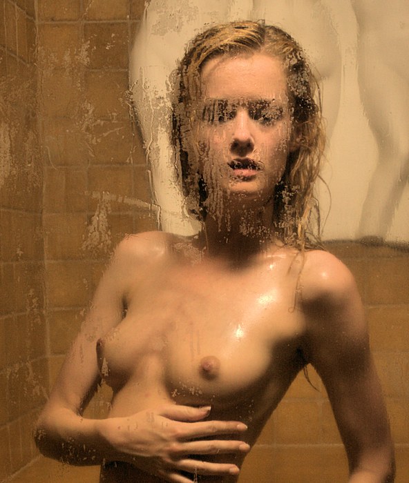
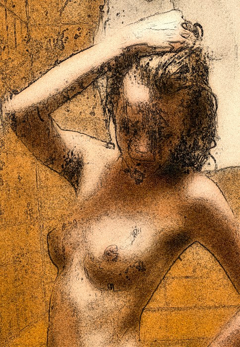
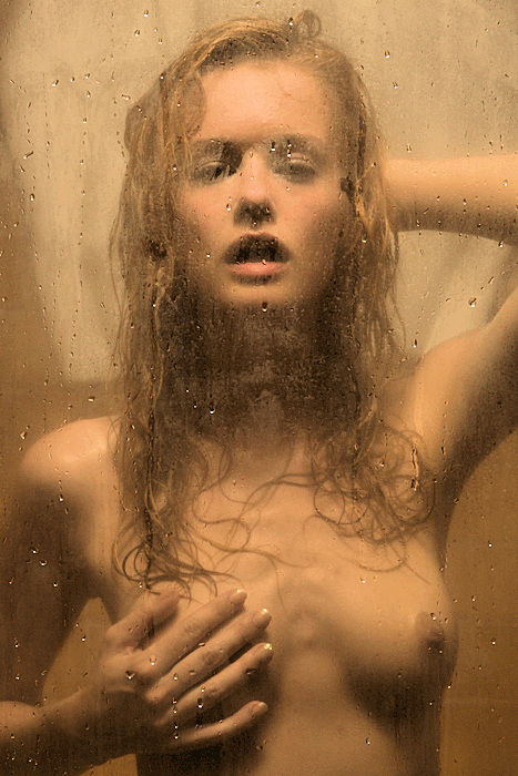
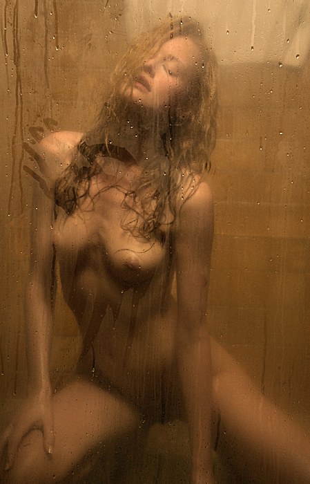
But this happened.
The glass window looking into the steam room mostly
cleared up. That was not what I expected -- I
expected it to get fogged up and remain fogged up.
Look -- you can see the white wall sculpture of the
Three Graces there behind Olivia! Usually, it's so
steamy in there that the sculpture just becomes a white
flur. I was expecting something foggy, like the
pictures featured in the previous session --
Sarah's
Kissing Session. Instead, we clear air.
At the time, this confused me. I asked Olivia
whether the water that was running was hot, and she
tells me that it's set at its hottest. Now -- I
have a theory: we were working during the warm
months, and the glass & the air inside the steam room
was already warm when we got started. So, my guess
is that we need a bigger temperature difference to get
the steam & fog. But I thought of this weeks after
this session -- it's something I'll have to test out in
the future. |
|
|
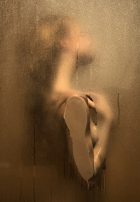
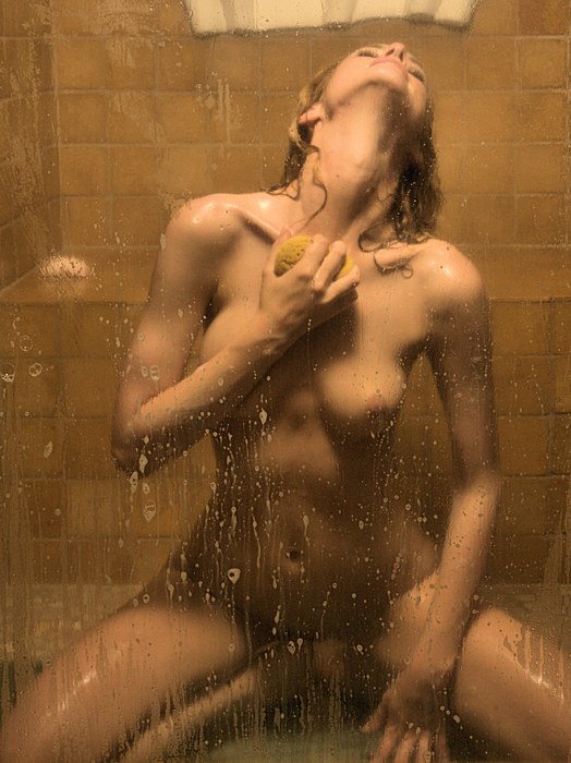
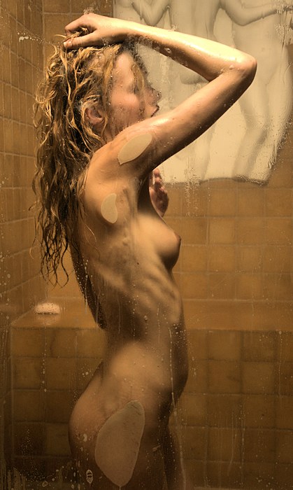
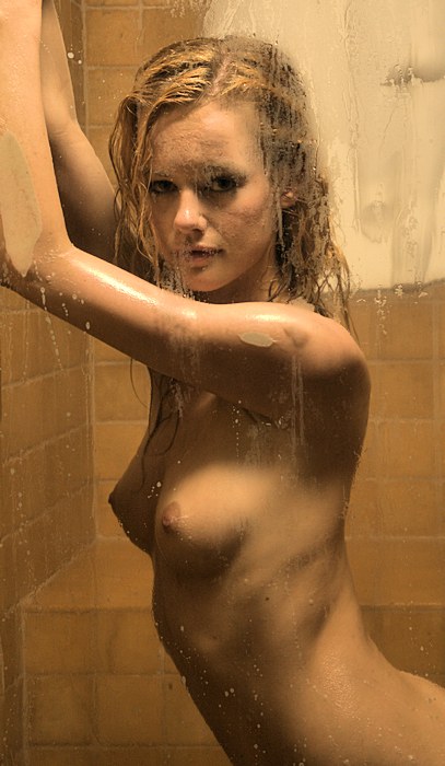
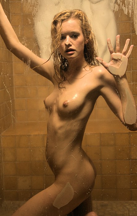
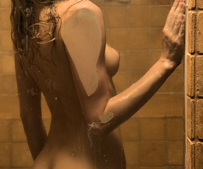
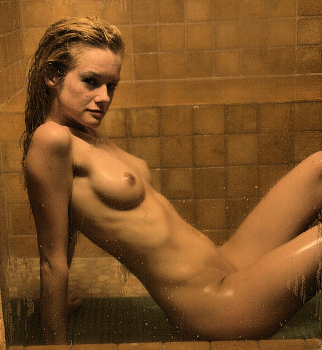
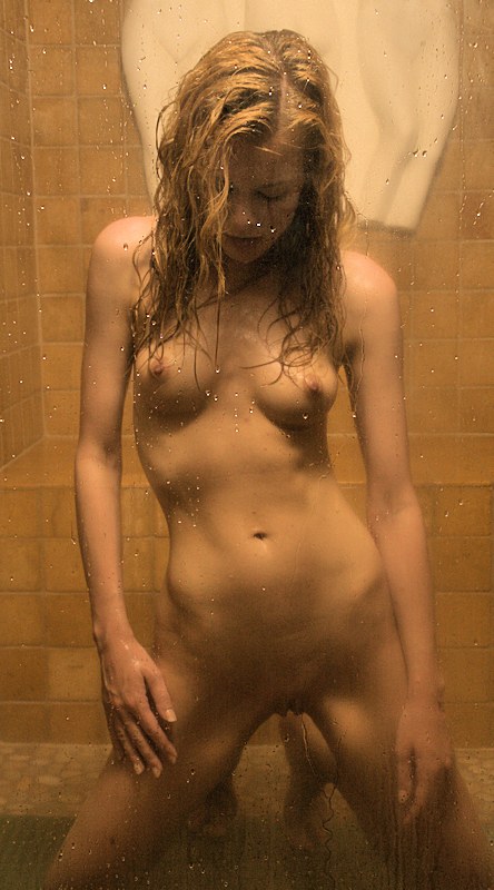
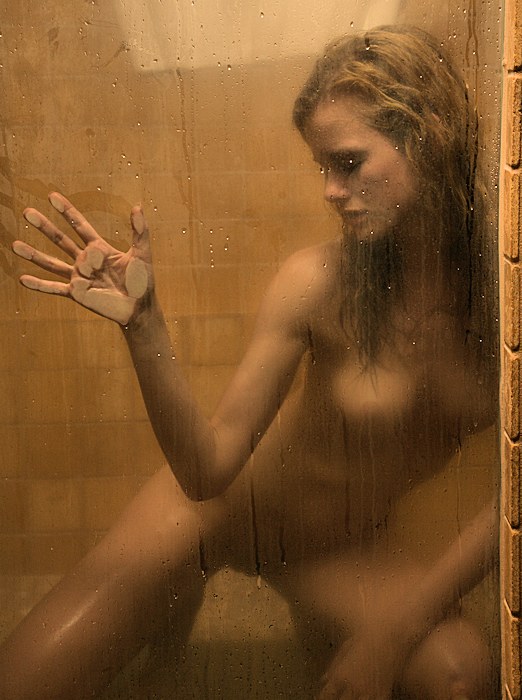
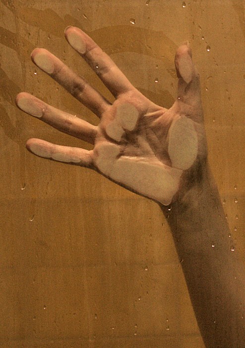
Note to self --
interesting things happen when Olivia presses her chest,
her arms, and her hands to the glass. Pressing her
nose to the glass -- not so much.
Models are left
pretty much on their own when they are in the steam
room, but being warm & wet -- that's a sensuous
experiences for many of them. |
|
|
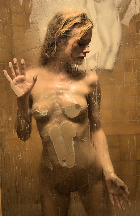
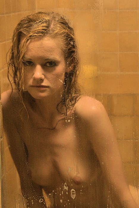
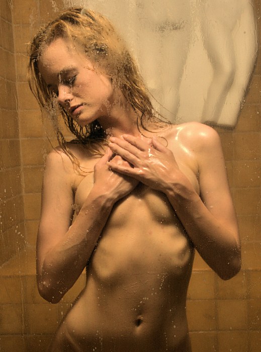
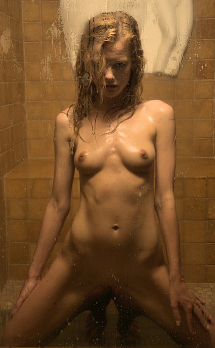
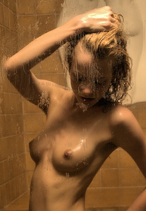
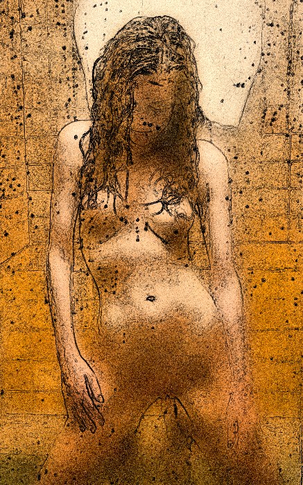
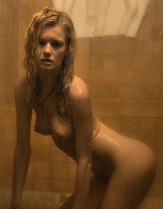
Olivia has a very expressive face. I'm not sure
what she's thinking in this one. Got a guess?
Let me know. |
|
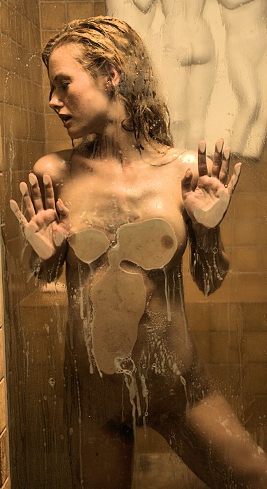
I am always looking for alternative
cropping. Well, let's start with a little honesty --
pretty much every image you see on this web site is cropped
somewhat. My first camera was a rangefinder, and one
never could be sure how much is captured in the image, so I
started with the assumption that I needed to take half a
step back & include a little extra in each exposure I made;
thus, every image gets cropped down to my original vision.
But sometimes, I go further (and sometimes, I go much
further). I tend to want to include the minimum
necessary information in each image. So, here's an
example. Study the image above -- is everything in it
necessary? Is that soap on the bench necessary.
Is all of Olivia's lovely figure necessary. Below is
an alternative cropping that I like. What do you
think? |
|
|
|
| While I miss the
steamy / foggy effect, I am enjoying these images.
Olivia is exceptional coming up with movement on her own
(with minimal interaction with me), and her figure is
still breathtaking. |
|
|
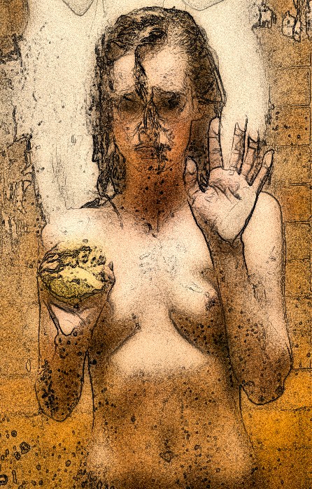
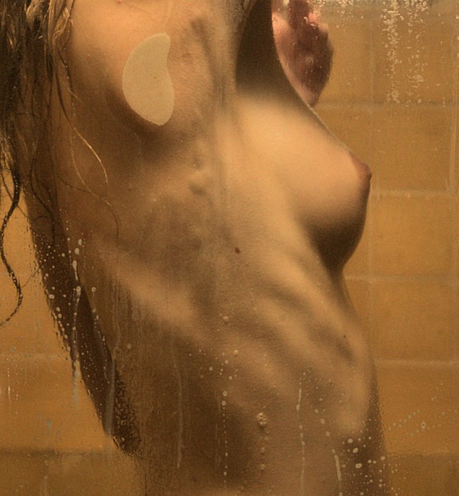
Another cropping
exercise. I like the simmering expression on Olivia's
face, which is enhanced by the "lit from above" lighting.
But I figure that the area from Olivia's waist and below
isn't contributing much to the image. Hence, the
alternative cropping on the right.
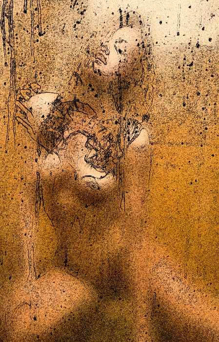
And the artistic
effects, below, are just for fun. Enjoy. |
|
|
|
|
|
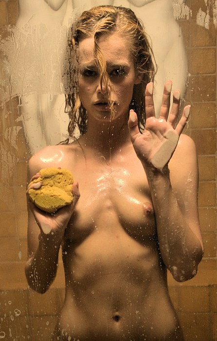
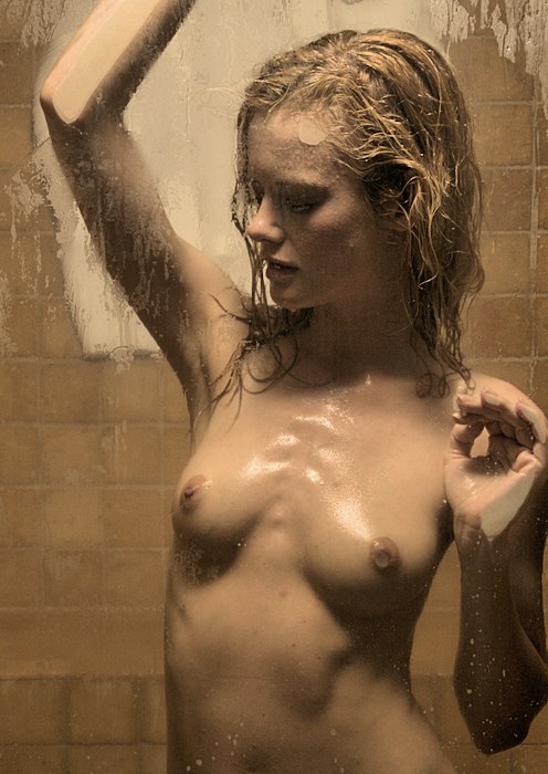
I'm including this specific image
because I don't like it. Don't get me wrong -- I am
very happy working with Olivia, but I have technical issues
with this image.
I often play a game: I
look at a piece of art and I try to guess the gender of the
artist. I'll claim that I am right ~80% of the time.
Men & women just seem to have different styles & priorities.
One clue that I use is this: men tend to be more tied
to gravity, and their images tend to be perfectly horizontal
or vertical; women are often much more free about such
things. Try it out for yourself.
So, I don't
like this image because I've accidentally tilted it to the
left by a few degrees. That's going to bother me.
Sure, I can use my photo editing software to straighten it
out, but I tend to want to get the original image as close
to perfect as possible, and that means not only the tilt but
also the focus, the exposure, and everything else.
In
these circumstances, getting things right is unexpectedly
difficult. The space is tight, so I'm using my
camera's widest setting, roughly 24mm. Now, if one
keeps the lens axis horizontal, that minimizes any wide
angle distortion. But more often than not, I use the
window edges to judge the horizontal, but being at the edge,
that straight line becomes curved when it is placed at the
edge of the image frame.
It's nice that we got Olivia
down on the floor (see the mat that I use to spare the
model's knees?). But while the light is kinda nice
when the model is kneeling, it's kinda blah when the model
is just a foot or so lower.
But this commentary is
supposed to be educational, and one's mistakes are more
educational than one's successes. Enjoy. |
|
|
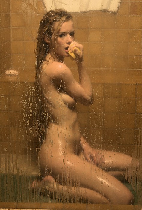
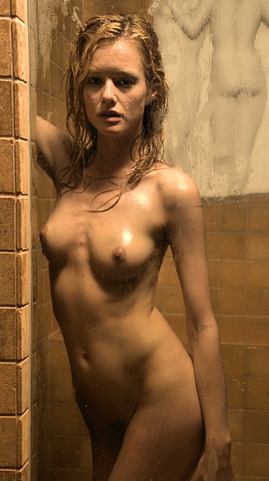
Here's a favorite
image from the whole session. It's so much a
favorite that I'm sharing a slightly larger version.
I like the jog in her stance, the introspective look on
her face, her muscle tone, her perfect figure.
I'm often asking myself about how long I should keep
going with a setup. Ever since I switched to
digital, I have practically no limits to how many
exposures I can make for a session or for a setup.
So, I am constantly asking myself when I've done enough,
and my first clue is if I find myself making similar
images over & over. To be honest, now as I am
drafting these pages, I do find that the interest in
these images had started to plateau out. But then
along comes this image. I like it a lot. I'm
glad I didn't stop working.
I find that with
digital, I have the opportunity to press on through
momentary roadblocks -- that's something I couldn't do
with film.
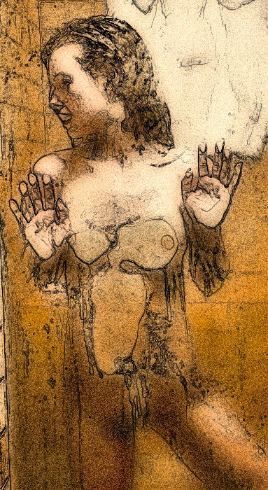
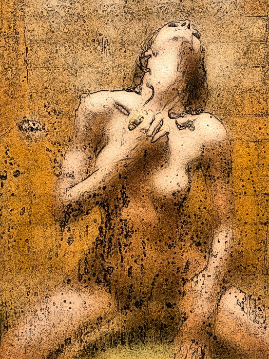
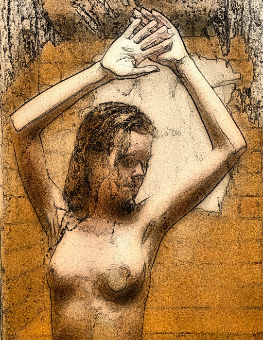
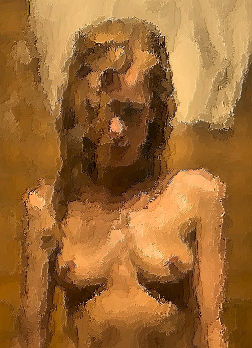
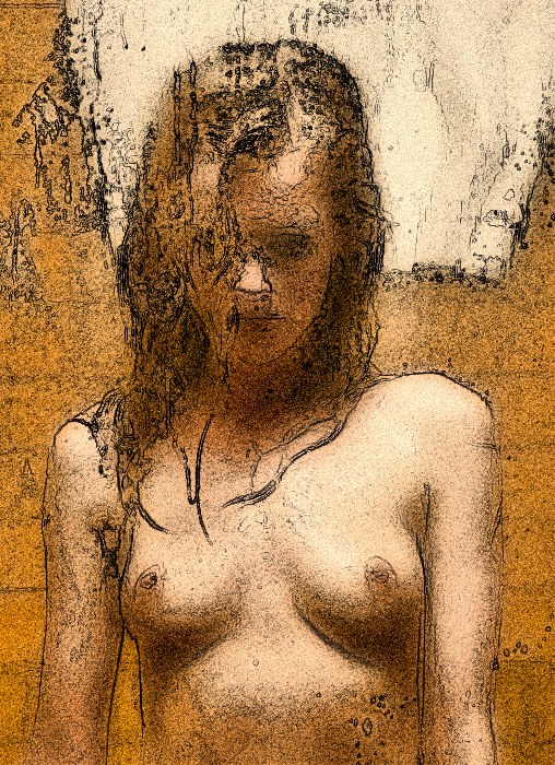
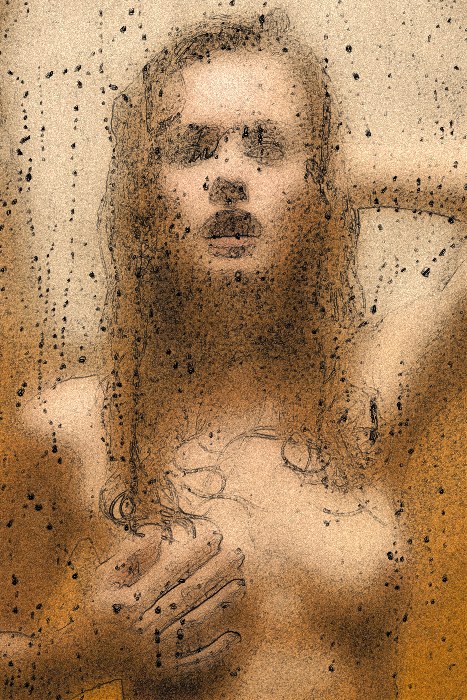
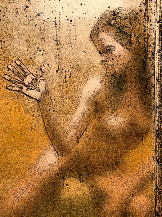
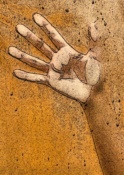
Okay -- below is an artistic
effects version of this image, using my new favorite
"airbrush & ink" effect. Enjoy. |
|
Here's another
cropping exercise. The row below represents my first
cropping, but I found a more radical cropping, in the row
below that. Did you see it?
|
|
|
|
|
Admittedly, this is
a much more radical cropping than usual, but I have to admit
that I like the "airbrush & ink" version a big lot.
|
|