|
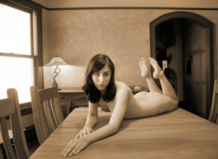
| Our first stop is the dining room.
I've put models on my dining room table before, and although
I've liked the results, I figure that I haven't yet made
the definitive image there. I still feel that way.
The lighting here is a combination: there are three
very large windows off the the left of this image, and there's
another Victorian house right nearby. Although those
three windows are facing north, the light bounces off the
white neighboring house, creating some soft window light.
However, the dining room table is a few feet from those
windows, and that window light is fairly weak when it arrives
at the table. Thus, I add the room lights. There
is a chandelier over the table as well as spot lights in
the ceiling pointing down. I also turn on that favorite
lamp on the nice sideboard in the back. Together,
that's enough to light to work with.
|
|
|
|
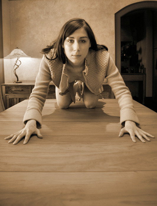
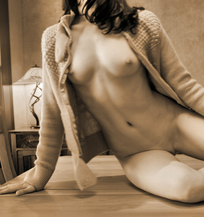
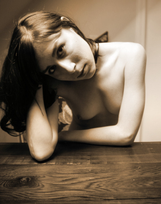
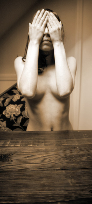
Like I said,
I don't think I've yet made the definitive "on the
table" image yet, but this is close. I like the
light on Floofie's face and the slightly darker light on
her torso. There's a little wide angle distortion
going on, but it's subtle -- it makes her legs look long &
lovely.
Normally,
there's a large art piece on the back wall, but if I had
left it up, the glass reflects blocks of light -- you can't
see the art, and leaving it up is pure distraction.
But with the art down, the back wall looks a little empty.
Got to think about that for next time.
|
|
|
|
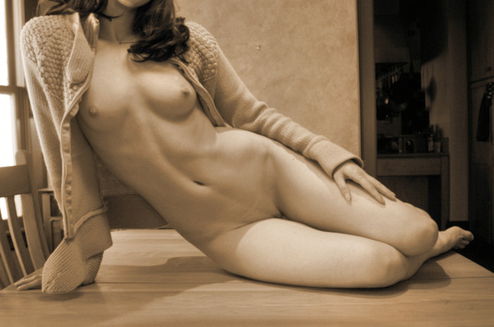
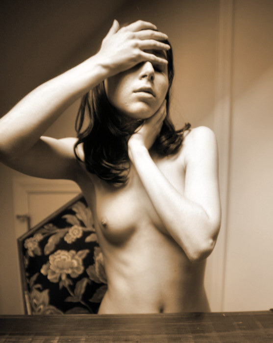
Floofie is
looking out the window -- from that spot, you can still
see some traffic moving past the house. I'm not a
big fan of the "modeling looking off into the distance"
pictures -- I always wonder what she's looking at and why
the photographer has lost her attention. I like eye
contact, or at the very least, if there isn't any eye contact,
I like the model to look at something within the image frame.
Failing that, I don't mind the model closing her eyes.
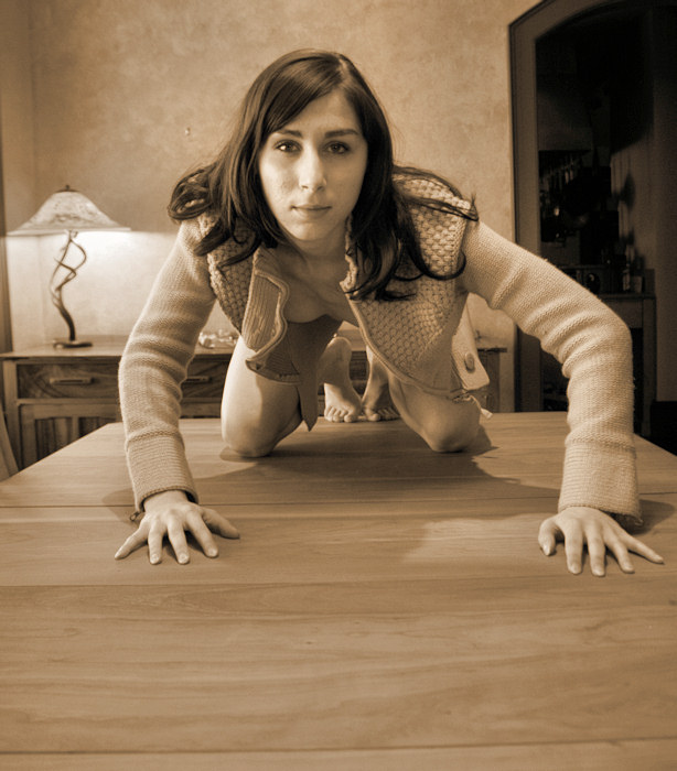
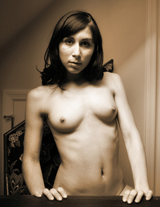
So, below is a cropping of the above image. |
|
|
|
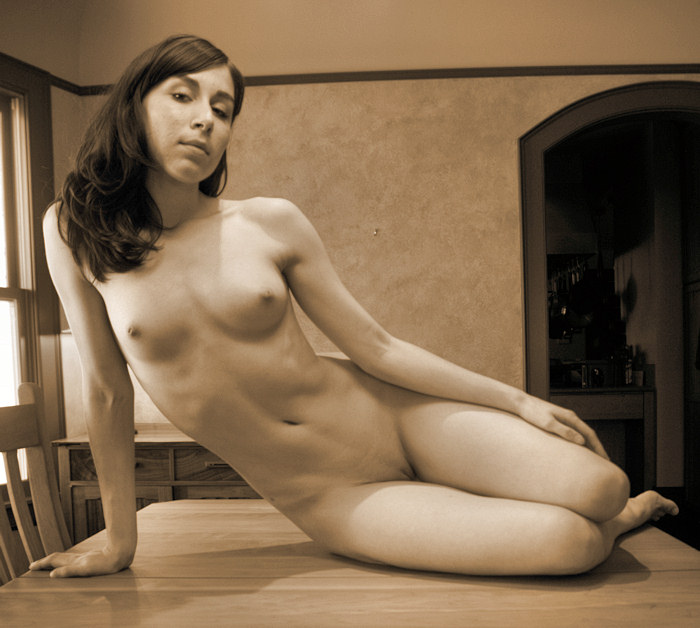
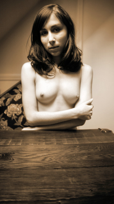
Just because
you have a camera in your hand & a beautiful nude model
in front of you, that doesn't mean you should stop looking &
seeing. In addition, you've got to try some ideas
before you can evaluate whether the idea is worthwhile.
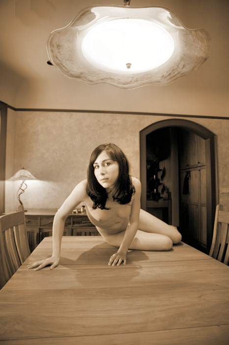
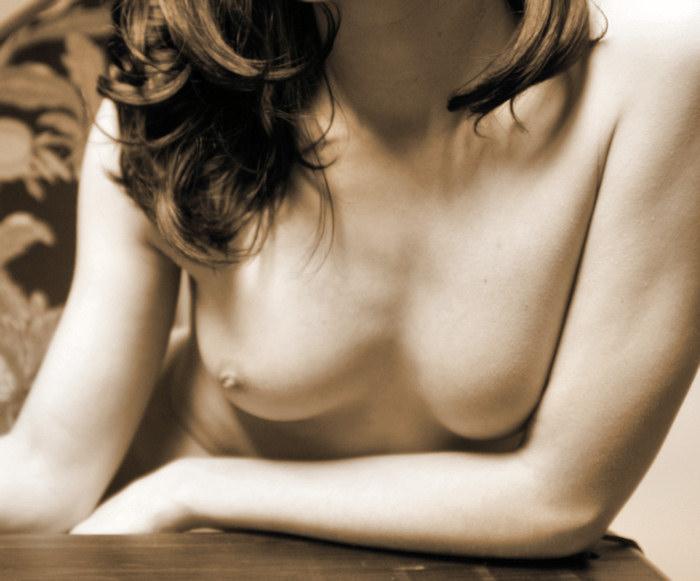
What
do you think of this image?
My assessment:
-
With a wider angle setting on the lens, I include more
of the dining room table in the foreground. My
thought was to include more of the room in the image.
-
It doesn't quite work for me. Perhaps I need an
alternative piece of art (something without a reflective
glass cover) on the back wall. Perhaps I need
some food laid out on the table. I don't know.
-
Floofie is horizontal, but the image is cropped vertically.
I rarely like that -- the orientation of the subject &
the orientation of the image itself should compliment
each other, but this time, they are in conflict.
-
It bothers me that the grain of the table & the
line of the picture rail on the back wall are distorted &
not parallel.
-
It bothers me that the lamp on the sideboard is growing
out of Floofie's head.
So, this doesn't work for me.
Ah, well -- I wouldn't have known that if we hadn't tried
it.
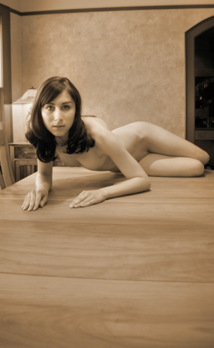
The image
below is a significant improvement.
|
|
|
|
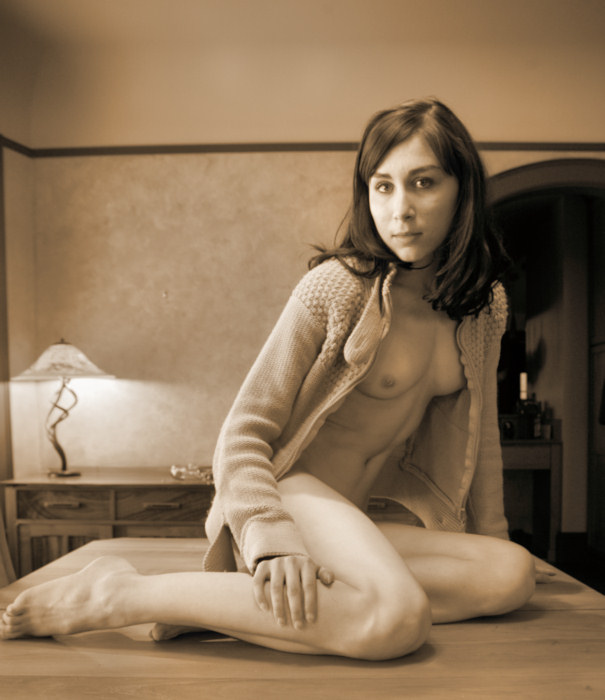
I can't tell
you how I know it's time to move on and find a new setup,
but somehow I do. It's probably because I run out
of ideas & start feeling that I'm not improving the
basic concepts anymore, or maybe I just lose forward momentum.
In any case, we abandon the dining room & move upstairs
to the guest room.
The top
floor is a very large finished attic. The side walls
are only four feet tall, then the walls slant up as they
mirror the roofline, finally there's a traditional height
ceiling that's maybe thirteen feet wide.
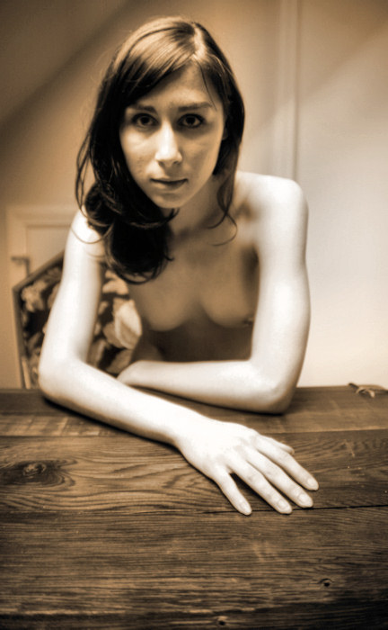
In the
guest room is a little vestibule of sorts. There's
a door right there at the right edge of the image -- that's
the staircase going down. On the left side of the
image, just out of the image frame, is the four foot wall &
the slated roofline wall. In the slanted part is a
skylight, and I love skylight light. We stop at the
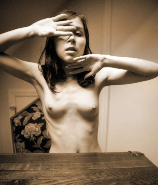
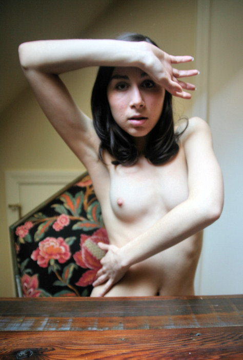
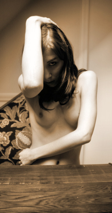
cozy handmade table & chairs for some images.
|
|
|
|
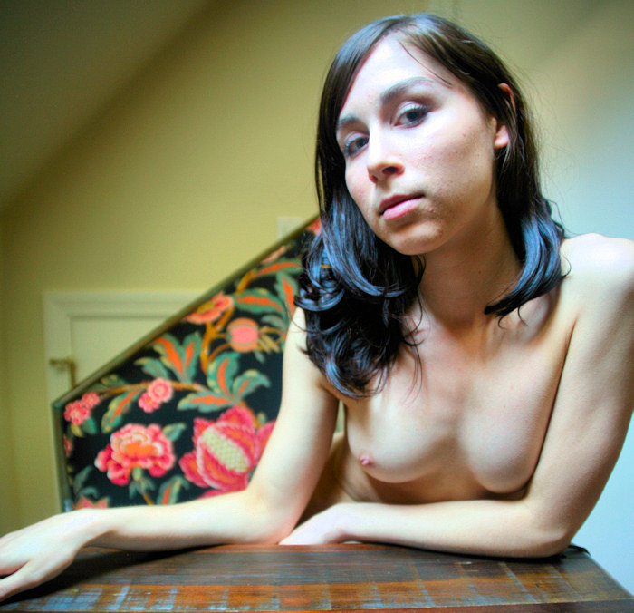
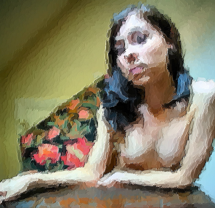
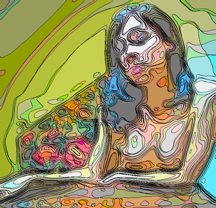
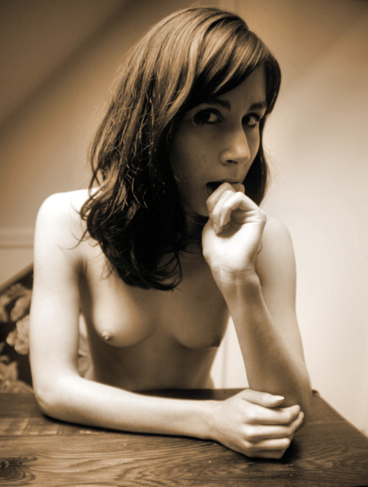
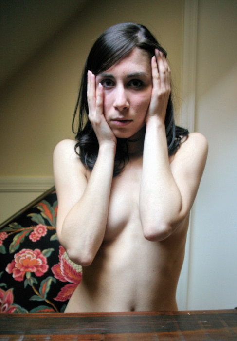
I feel some
artistic effect variations coming on... |
|
|
There's a more
relaxed feel to this image, making it appear to be more
intimate.
We work
to get Floofie's hands involved.
|
|
|
I
think that the difference between a natural-light photographer &
a studio photographer is radical. Pretty much all photographers
start out by using natural light, and when you use natural light, you
just have to find ways to take advantage of that which Mother Nature
gives you. When you work with artificial light, you can imagine
a lighting effect and you work to create or sculpt that lighting.
These are two different disciplines. In any case, I enjoy both
natural & artificial light photography, but on this particular bright
sunny day in June, I am finding plenty of lovely natural light.
We continue wandering about the house in search for good light.
About The House, Page 2
|