Lots of
folks have asked me how I applied the various artistic effects.
I'm happy to share the technique, but I'm afraid that lots
of folks are going to be disappointed:
-
I don't use Photoshop, so I just can't tell anyone how
to do this in Photoshop.
-
It's real easy. In fact, I most often use the
default settings.
My photo-editing
software is
Paint Shop Pro X2. I've been using PSP for many
years. In the old days, PSP was free while Photoshop
cost several hundreds of dollars. Nowadays, PSP is
a purchasable product, and its purchase price is comparable
to many versions of Photoshop. I've been tempted to
convert to Photoshop (because there are more books &
classes for Photoshop), but I've never gotten around to
switching. Besides, I don't think Photoshop can do
these artistic effects as easily as PSP.
In any
case, these artistic effects are some of the bells &
whistles in Paint Shop Pro. So, sorry, there's no
magic technique I can teach to a Photoshop person.
|
|
|
The "Enamel" Effect
|
|
Step One
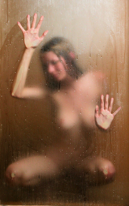
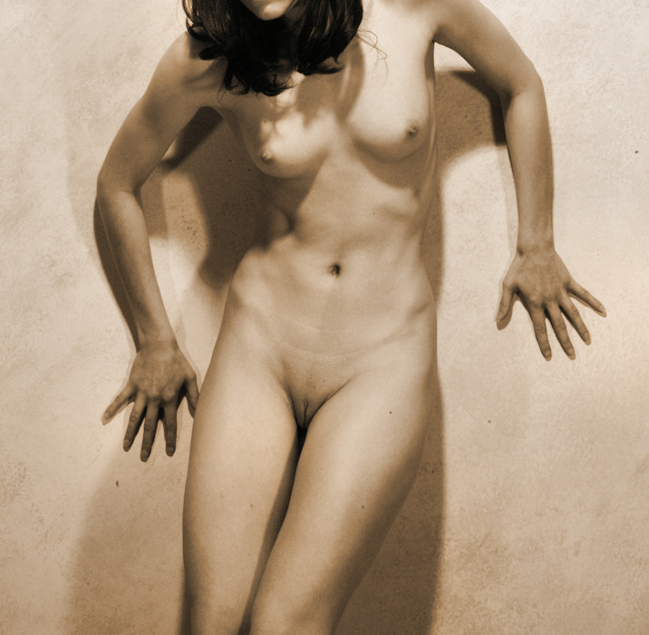
Here's
the original full frame.
Some
photographers revel in filling their camera viewfinder with
the original image. Not me. I do a lot of cropping.
That comes from working with my original camera -- an old
antique rangefinder. One can never be sure where the
edges of the image are, so I got in the habit of stepping
back & including more than I needed in the image.
Besides,
cropping is fun.
This
particular image was from the last page of
my first
sitting with Valentine.
|
|
|
Step Two
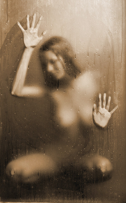
Here's
the cropping I chose.
I chose
to eliminate the edges of the window -- without that context,
the remaining image is a bit more abstract. (I've
also done an alternative, more radical cropping, where Valentine's
hands are in the opposite corners of the image).
I like
doing the cropping as the very first step in my photo-processing.
The resulting file is smaller & easier/quicker to edit.
Once
I have the cropping I like, I resize the image for web presentation.
Nowadays, I resize the image to be 700 pixels in the longest
dimension. I also save a separate edited version that
wasn't resized -- that's the version I use when printing.
|
|
|
Step Three
The next
step is some basic image adjustments.
Paint
Shop Pro X2 has a one-stop command, called "Smart Photo
Fix", but these steps are easy enough to do separately.
The basic adjustments:
-
Made the shadows a tad darker.
-
Made the highlights a tad brighter.
-
Made the overall picture a tad brighter.
-
Ramped up the color saturation just a bit.
-
Added just a little image sharpening.
The purpose
of this image is to be a bit blurred (by the steam in the
steam room) -- I like that there are areas that are indistinct.
|
|
|
Step Four
My pseudo-sepia
toning is part of my personal style, and since this image
is almost monochromatic already, I decided to apply my sepia
toning. PSP has a "Colorize" command, which
I use with the following parameters:
PSP also
has a "Clarify" command which gives the tones
a little pop. I apply it with a very low setting (1.0).
|
|
|
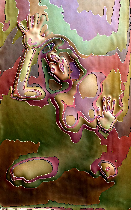
Step Five
Nearly
all of the time, I stop with the sepia toned image, but
on occasion, I like to go a little wild. For this
image, since it is already abstract, I decide to experiment
a bit.
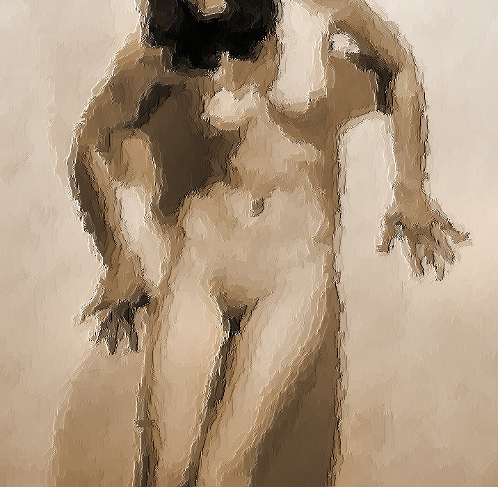
Starting
with the colored image from "Step Three", I apply
PSP's "Artistic Effects -- Enamel" command, with
its default settings:
-
Blur = 20
-
Detail = 16
-
Density = 16
-
Angle (of the "light source") = 45
-
Color (of the edges) = white
It's
fun to play with these settings, but as much as I've played
with them, I still like the default settings the best.
Go figure.
I chose
to start with the color image, not the sepia image.
I've used this "enamel" effect on sepia images,
and the result does have multiple colors, but in those cases,
the colors are from a fairly restricted palette. Starting
with a color image results in a somewhat more colorful enamel
effect.
|
|
|
Step Six
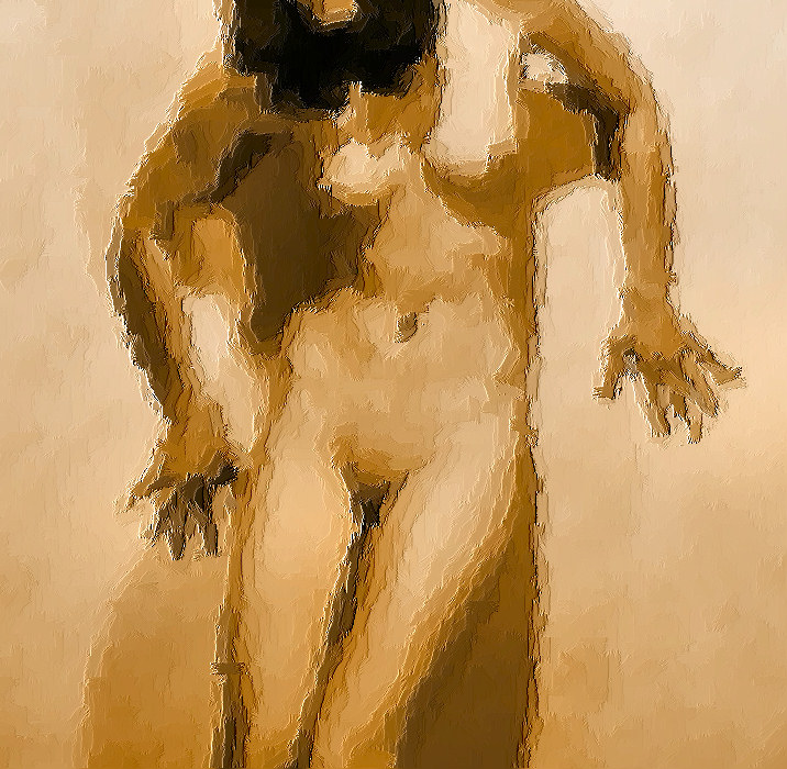
We are
almost done. The last step is to ratchet up the color
saturation. In this case, I use PSP's "Automatic
Saturation Enhancement" command with the following
settings:
-
Bias: More Colorful
-
Strength: Strong
I also take this opportunity to apply the "Clarify"
command with a low setting (1.0).
That's it. That's how it's done.
|
|
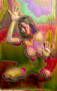
Here's another image with the "Enamel
Effect" applied, presented in a different
manner (if you have a slow connection, you'll
have to be patient while it loads). This
image is of
Jessica
from her Fourth Visit. |
|
|
|
|
|
The "Paint Brush" Effect
|
|
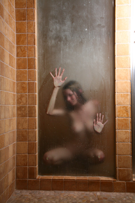
Step One
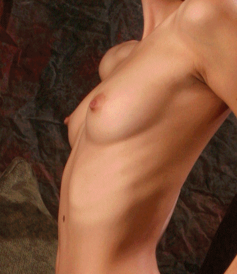
Here's
the original full frame.
Some
photographers revel in filling their camera viewfinder with
the original image. Not me. I do a lot of cropping.
That comes from working with my original camera -- an old
antique rangefinder. One can never be sure where the
edges of the image are, so I got in the habit of stepping
back & including more than I needed in the image.
To be
honest, I didn't like this image a whole lot when I first
saw it. While I love Floofie's svelte & shapely
figure, this image made me a little uneasy:
-
Her left shoulder almost looks dislocated.
-
Floofie has a lovely face, but I'm not sure about its
position here -- is she turning away?
There
are plenty of images of Floofie's lovely face that I like,
but not this one. So, I look to cropping to see if
I can "save" this particular images.
This
particular image was from the second page of
my first sitting
with Floofie.
|
|
|
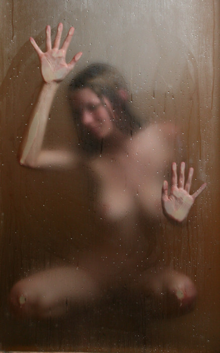
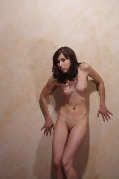
Step Two
Here's
the cropping I chose.
I chose
to eliminate that bony or "dislocated" shoulder.
I've never been a big fan of knees, either, so I cropped
above them, too.
I also
like doing the cropping as the very first step in my photo-processing.
The resulting file is smaller & easier/quicker to edit.
Once
I have the cropping I like, I resize the image for web presentation.
Nowadays, I resize the image to be 700 pixels in the longest
dimension. I also save a separate edited version that
wasn't resized -- that's the version I use when printing.
|
|
|
Step Three
The next
step is some basic image adjustments.
Paint
Shop Pro X2 has a one-stop command, called "Smart Photo
Fix", but these steps are easy enough to do separately.
The basic adjustments:
-
Made the shadows a lot darker.
-
Made the highlights somewhat brighter.
-
Made the overall picture somewhat brighter.
-
Ramped up the color saturation just a bit.
-
Added just a little image sharpening.
I'm already
liking this image a lot more.
|
|
|
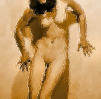
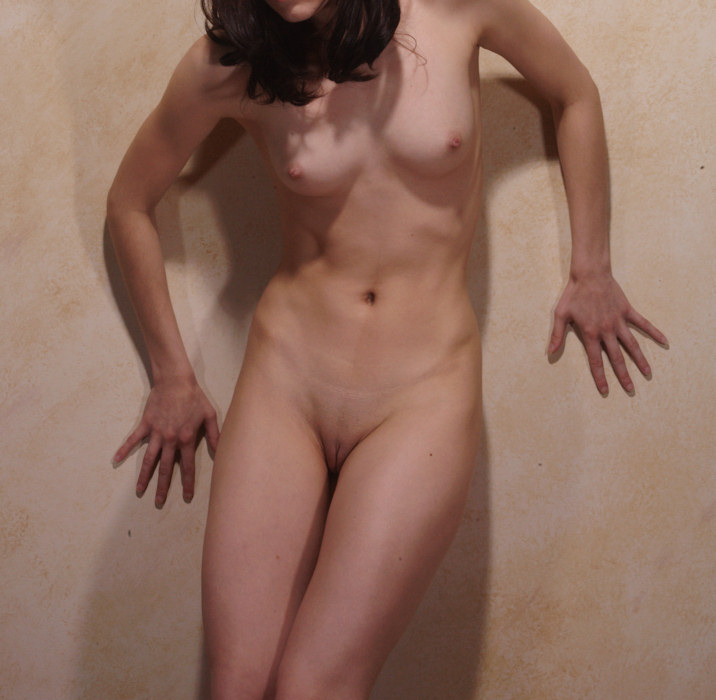
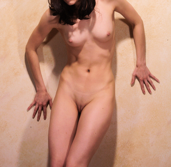
Step Four
My pseudo-sepia
toning is part of my personal style, and since this image
is almost monochromatic already, I decided to apply my sepia
toning. PSP has a "Colorize" command, which
I use with the following parameters:
PSP also
has a "Clarify" command which gives the tones
a little pop. I apply it with a low setting (2.0).
I like
this image quite a bit. I love the shapes & shadows.
|
|
|
Step Five
Nearly
all of the time, I stop with the sepia toned image, but
on occasion, I like to go a little wild. For this
image, I decide to experiment a bit.
Starting
with the sepia image from "Step Four", I apply
PSP's "Art Media Effects -- Brush Strokes" command,
with its default settings:
-
Softness = 20
-
Length = 10
-
Density = 25
-
Bristle = 160
-
Width = 5
-
Opacity = 50
-
Angle = 102
-
Color = Black
It's
fun to play with these settings, but as much as I've played
with them, I still like the default settings the best, especially
when working with images of this size. When I work
with larger images, I do have to tweak these settings a
lot.
|
|
|
Step Six
We are
almost done. The last step is to ratchet up the color
saturation. In this case, I use PSP's "Automatic
Saturation Enhancement" command with the following
settings:
-
Bias: More Colorful
-
Strength: Strong
Even though this effect was applied to a monochromatic
image, the results are very interesting to me. The
original color image didn't exactly have a lot of color
to it, so I saw no point in starting with it. The
"enamel" effect does add
new colors to the image, but this "Paint Brush"
effect just uses the colors of the image.
That's it. That's how it's done.
|
|
|
There are other effects that I enjoy playing with.
Let me know if you would like to see similar step-by-step descriptions
on how I've applied them. I also note that the
Paint Shop Pro product information web page offers a free trial
of PSP, if you want to experiment on your own.
|