|
Lately, I've
been applying various "artistic effects" to many
(most?) of the images I see (mine & others). In
particular, I enjoy the "brush strokes" effect
a lot. There could be a lot of reasons:
-
I've come
to admire the cerebral & perception process involved
in creating paintings. My favorite:
Vincent van Gogh.
-
My eyes
are aging, and I just don't see fine details like I
used to.
-
For a long
time, I've always been fascinated how simple pictures
can convey lots of information.
-
I like
seeing how a simple brush stroke can convey a world
of information.
I've been doing
these artistic effects for a while, and I've been sharing
these pictures on this web site. Frankly, not too
many people have responded favorably to these images, but
that's okay. I'm still fascinated, and I've been applying
these effects to more & more images.
So, as a compromise,
I'll include the artistic effect images here, on a separate
page.
|
|
|
|
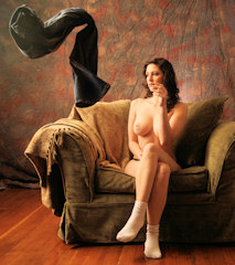
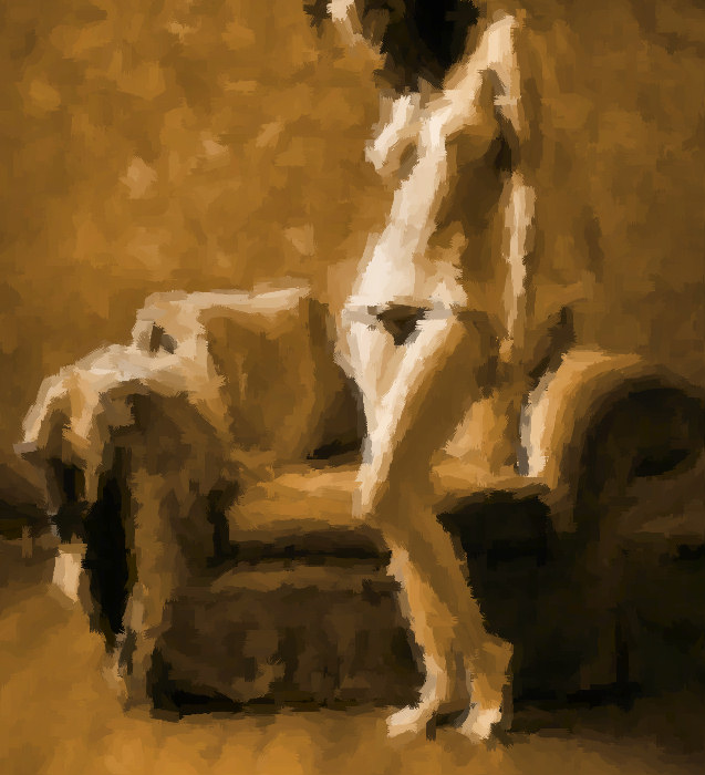
I'm going
to experiment with various ways of presenting these heavily
modified images. Here, I'm showing a small copy of
the original image with the normal sized copy of the modified
image.
Feedback
on the various presentation alternatives would be appreciated.
|
|
|
|
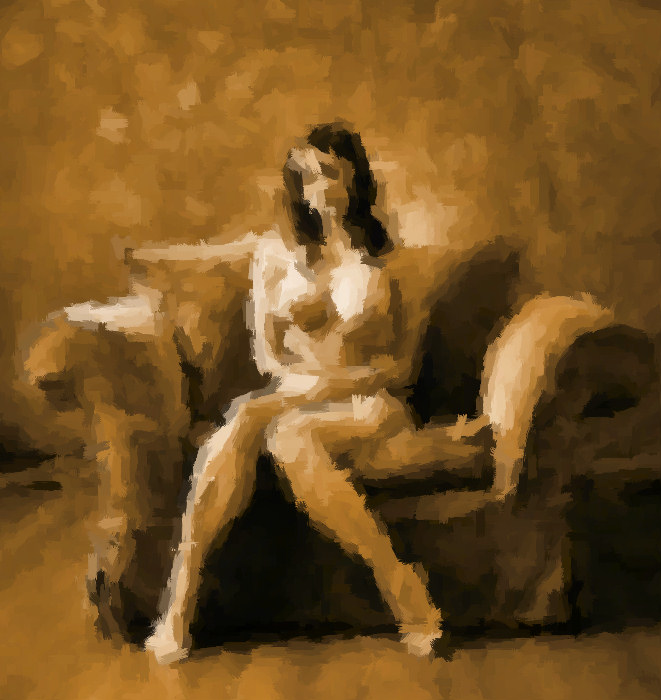
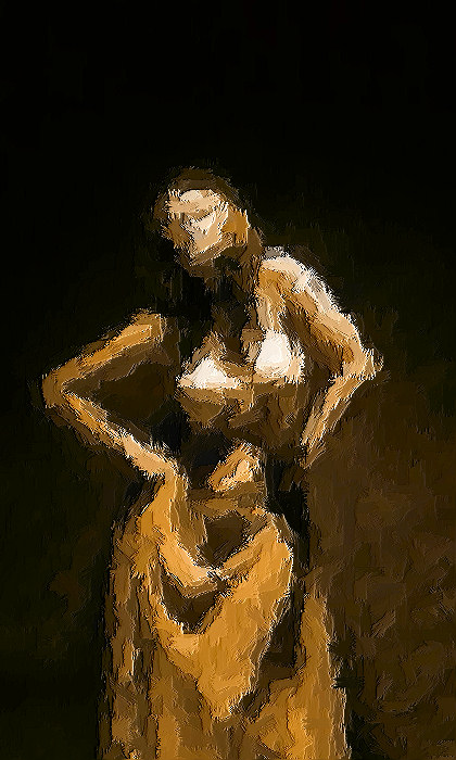
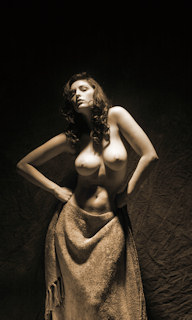
Same
idea, but with a bigger copy of the original image.
|
|
No copy
of the original image this time. Go check the
More Melted World page
for the original.
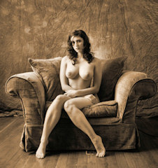
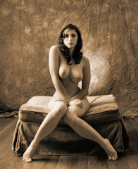
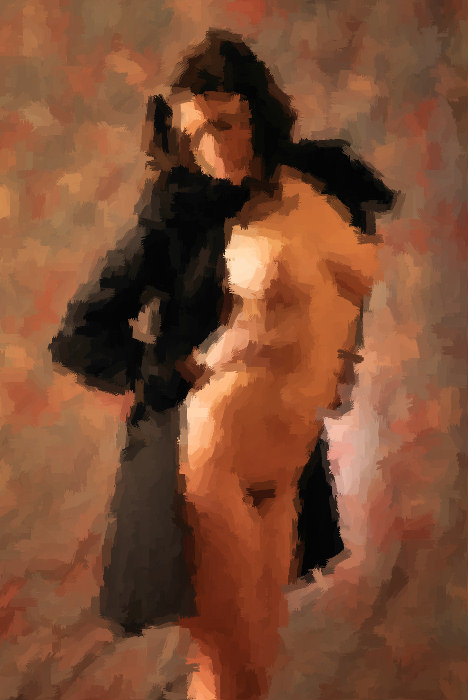
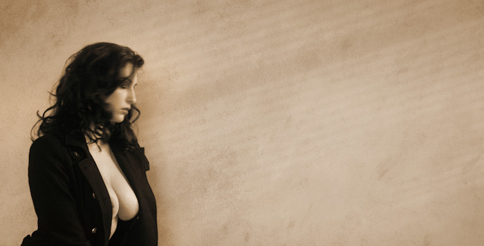
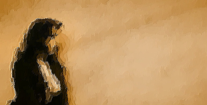
Converting
color to monochromatic is another form of abstraction.
In this example, I actually apply the brush stroke effect
on the sepia version of the image (and bumping up the saturation
afterwards). I still like the effect here. Pull
your eyes away from Carlotta for a second, check out the
chair. That's kinda what my vision is like on
its bad days.
In particular,
I like how the brush stroke effect highlights the play of
light & dark. And that's my approach to photography:
more than anything else, I like the play of light &
dark tones across the image space. Applying this effect
reduces the image down to the parts I like most.
|
|
|
|
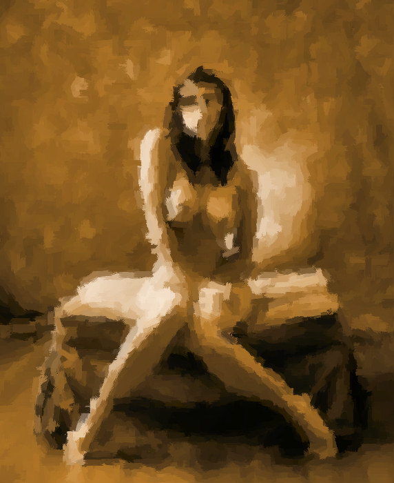
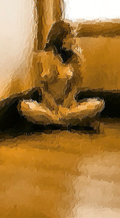
In fact,
now that I think about it, that's a significant exercise
for all students of photography -- at its most basic, photography
is all about light, and light is what we react to.
That image above is not a photograph of a lovely nude woman
on a big comfy chair -- it is a record of light bouncing
off those things. It's all about light & tone.
|
|
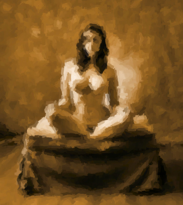
I am
in the habit of "deconstructing" the pictures
I see -- I like to figure out how the image was put together,
with particular attention to how the image was lit.
If you are working in a studio, you are creating the lighting,
so knowing how other photographs were lit is a great learning
device.
I note
that using this brush stroke effect does remove a great
deal of detail from the image, but the lighting scheme remains.
In fact, it seems easier to identify the lighting elements
without the distraction of the details.
|
|
|
|
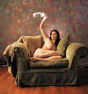
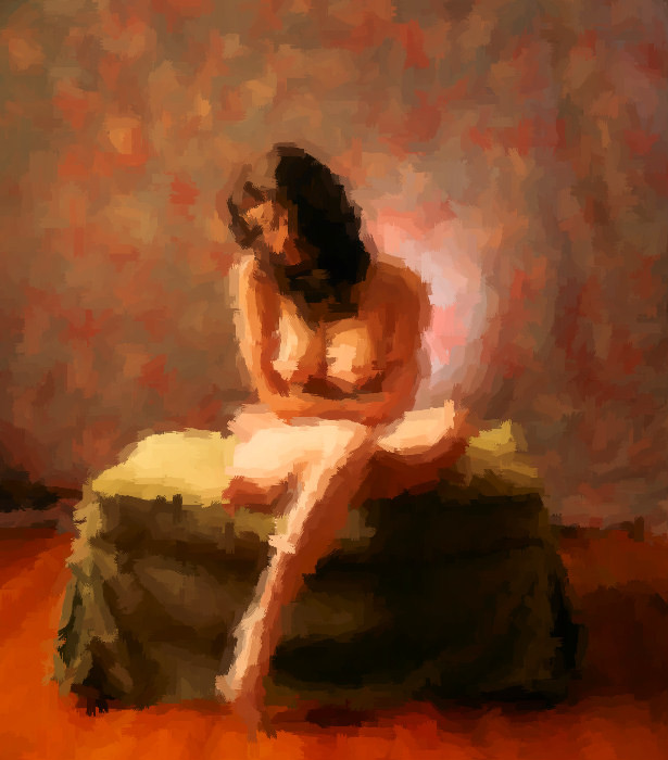
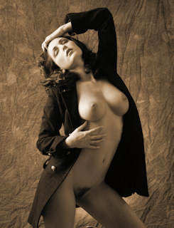
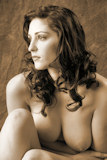
I'm including
a version of the original image here on purpose. To
be honest, I don't like the original: the lighting,
tonality, and pose are fine, but I just didn't like the
expression on Carlotta's face. But when I abstract
the image with the brush stroke effect, the exact expression
on Carlotta's face gets lost. Therefore, here's a
case where I like the abstracted image a lot more than the
original.
|
|
By far,
the "brush strokes" effect is my favorite, and
to me, it works well for both B&W and color originals.
The "enamel" effect is my second favorite.
In fact, these two effects are the only ones I try regularly.
Here
are examples of these two effects on this particular image.
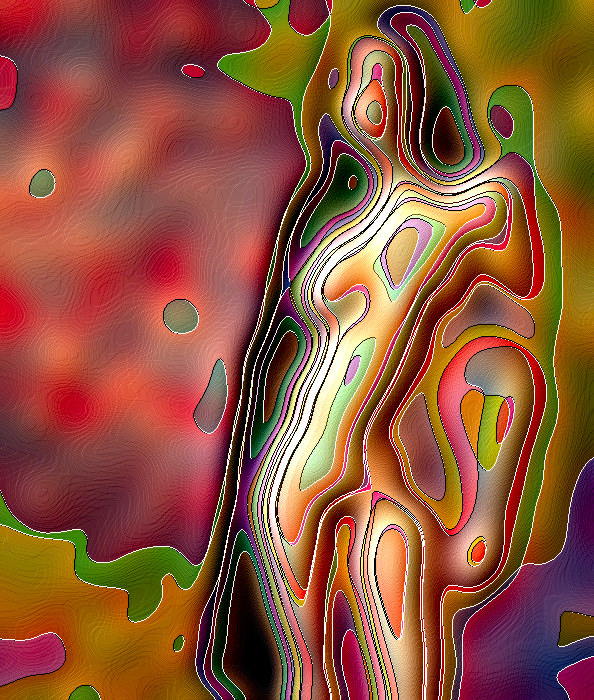
I should
point out that these effects are filters that accept a wide
range of parameters. For example, when applying the "brush
strokes" effect, one can adjust the size of the brush,
the length of the strokes, the angle of the light, etc.
Same thing with the "enamel" effect -- there are
plenty of adjustments to be made. In this example,
I chose to eliminate a big lot of the detail, making the
resulting image very abstract.
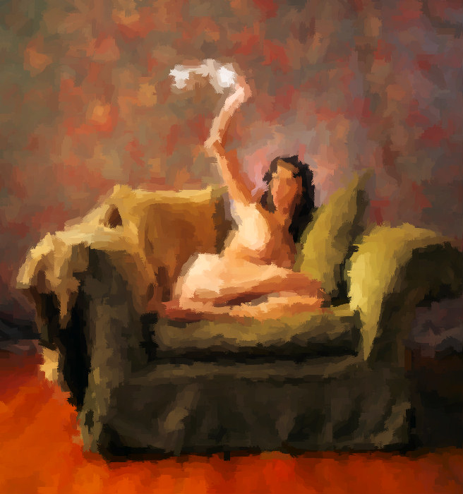
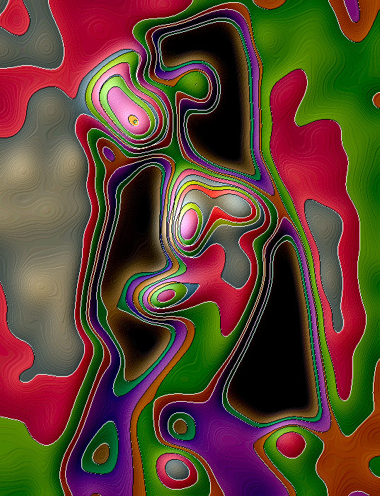
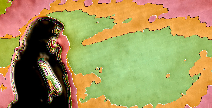
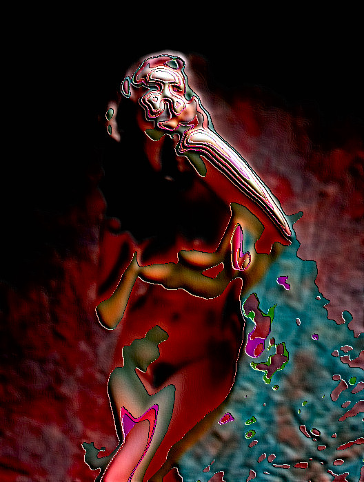
I do
like the "enamel" effect a lot, too. You
can barely recognize the figure (if at all), and the colors
that appear are often exciting. See the image below
for another example of the enamel effect.
Looks
interesting, right?
|
|
|
Here's another
presentation alternative -- presenting the artistic effect images
along with the original image.
|
|
|
|
|
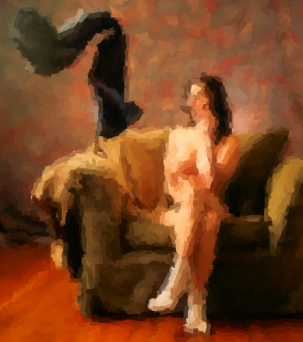
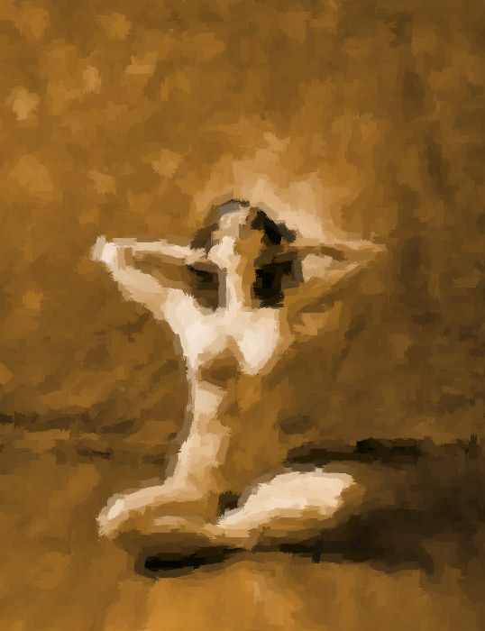
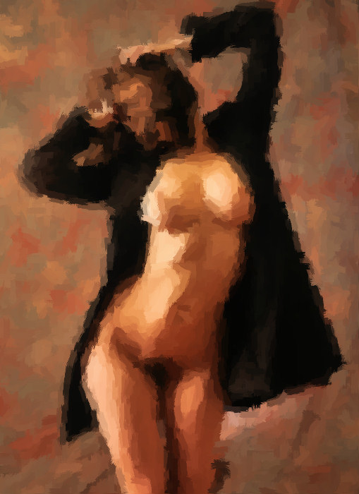
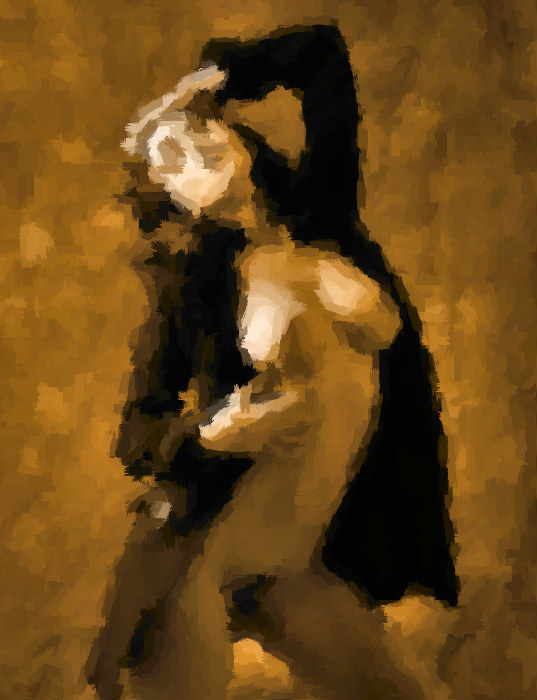
I really,
really, really like how the brush stroke effect turns out
with the black background / harsh light images. The
whole image decomposes into a couple dozen brush strokes,
yet the light & the movement comes through.
|
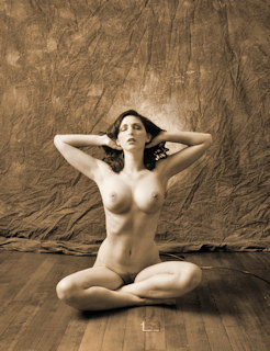
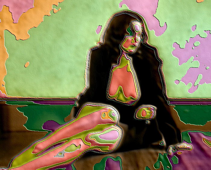
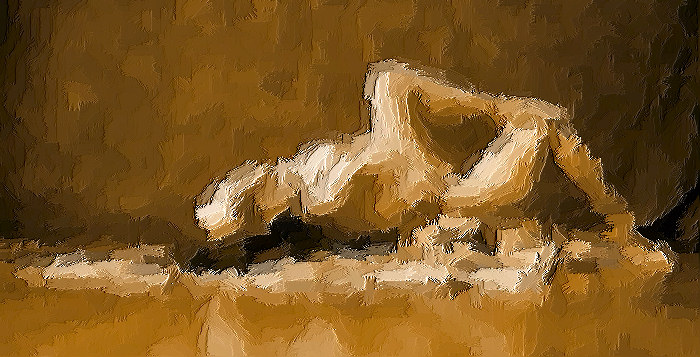
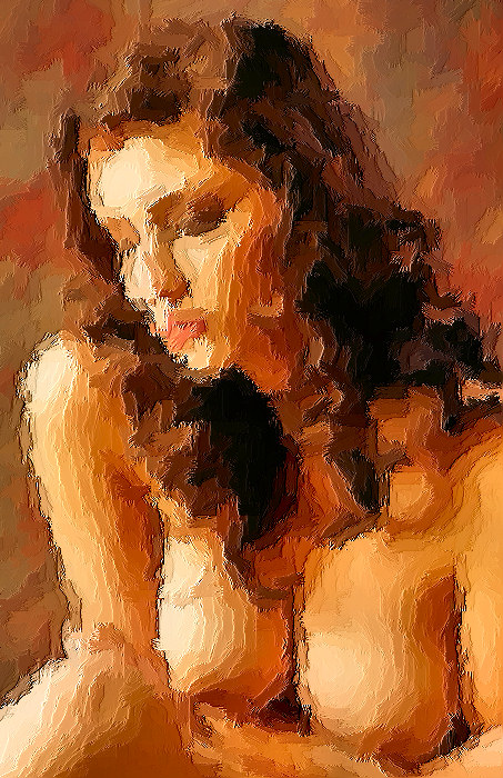
I've included
this particular image not because I like it but more because
I don't. I use the same default settings each time
I apply the brush strokes effect (and then tweak them as
necessary) -- here is this particular image with the default
settings. It is interesting that you can still recognize
Carlotta despite the abstractions, but still I don't like
it:
-
There's a principle -- use the largest brush stroke
that is comfortable. Here, the brush strokes are
too small, I think.
-
I am beginning to feel that the brush strokes effect
is more effective when the lighting is more dramatic.
The original image here has more subtle & gentle
lighitng.
I'm sure
that I could make improvement via tweaking, but I'm not
sure the end results would be worth it in this case.
|
|
|
|
I expect
that I'm going to continue experimenting with these (and
other) artistic effects for quite some time to come.
By applying
these artistic effects, my admiration for painters has increased.
In particular, I enjoy those paintings that can capture
wonderful light. I'm a photographer, and I'm not likely
to be satisfied with the results if I were to pick up some
paint brushes, but still, I would love to be able to create
a great & lively painting from a blank canvas.
As far
as presentation goes -- I don't think I like keeping all
the effects images on their own page -- I prefer to incorporate
the effects images on the pages with the original image.
I also am inclined to include fewer artistic effects images
than are presented here. I'm open to feedback, however.
We'll see -- it's a journey, not a destination.
Working
with Carlotta is a joy -- she is terrific, especially when
we can break away from the standard poses & work on
stuff that's inspired by the moment. I hope to work
with Carlotta again soon.
|
|