| Ever
notice that the vast majority of the images you see have
similar height-to-width ratios? There are two
semi-"standard" ratios: one
proportionate to the standard 8x10 photo-print size, and
the other proportionate to the proportions of a 35mm
sensor (or a typical digital camera sensor). I can
understand that -- photographers want to use the entire
negative or digital image size. In fact, I
occasionally see film prints where the edge of the
negative itself appear as a border for the print.
Ever
notice that the vast majority of the images you see
place the subject of interest smack dab in the center of
the image, and that the subject tends to fill the image
space. I can understand that, too -- if you are
looking at a belly button, you want to see the belly
button, and you are inclined to eliminate any extraneous
distractions.
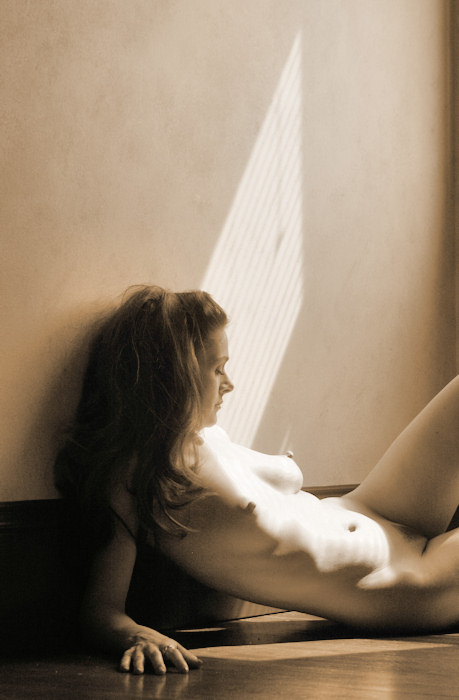
Well,
from the very first moment that I picked up a camera, I
resisted such tendencies. I love pictures with
unusual proportions (when it works). I love
putting the subject of interest off-center (when it
works). I love the sense of space. I love
strong & unusual compositions.
Don't
get me wrong -- pulling off these kind of images is a
difficult thing to do.
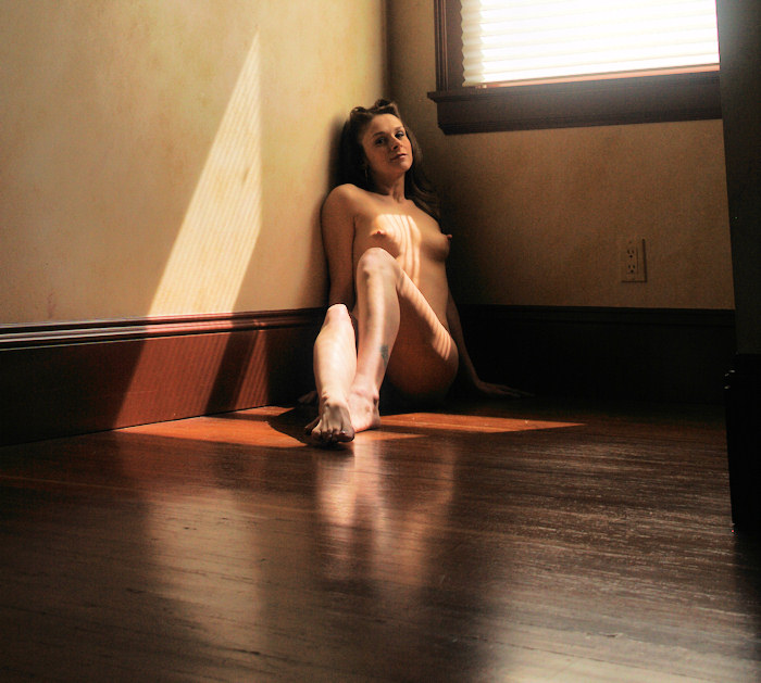
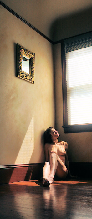
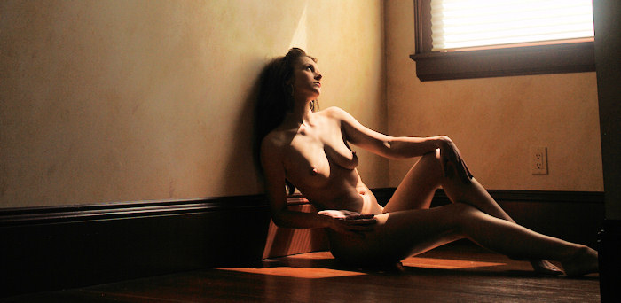
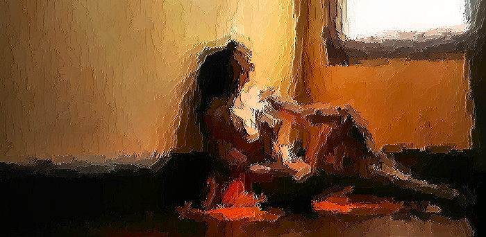
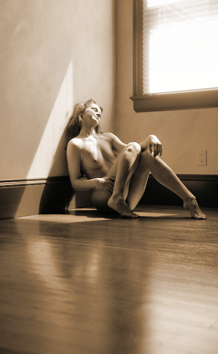
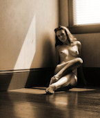
I
really love this picture -- it's just wide enough to
contain the entire patch of sunlight as it hits the
floor. I love the height, because the mirror on
the wall balances out the window itself. I don't
mind that Noname Jane is looking out of the image frame,
because
- You
can get an idea of what she is looking at, and
- She
is looking up, and the extra height of the image
contains her glance.
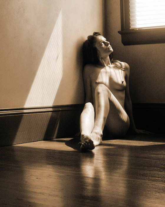
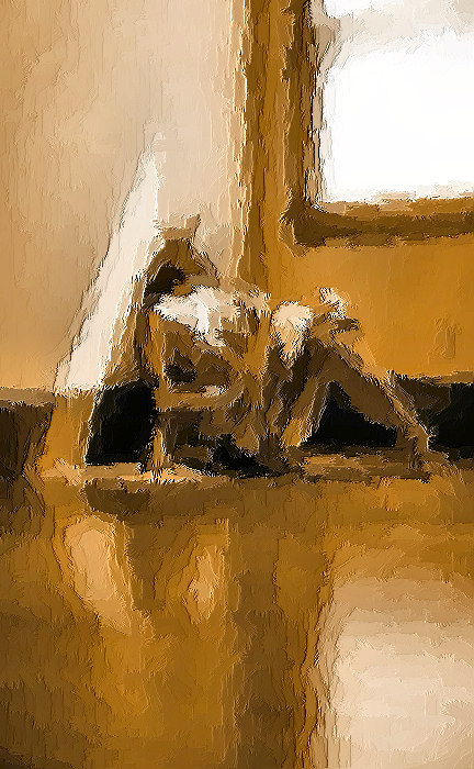
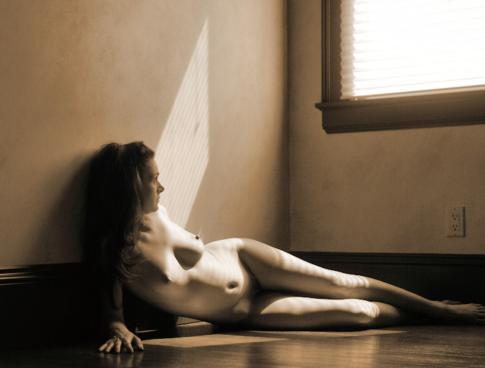
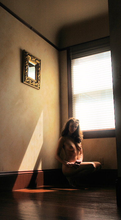
Compare
this image with the cropped version below. I think
the tall & skinny version is much more
exciting. Don't you? |