|
|
|
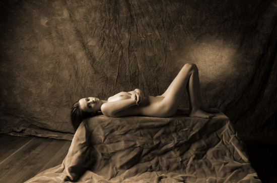
| Here's
a test shot from the next setup. I felt
that it was a little dark, so I made some
adjustments to the lighting & the
exposure. Still, I do like this first
image. I don't know what it is about
Kristin, but when I work with her, I am
inspired to create some "master art
painter" lighting. |
|
|
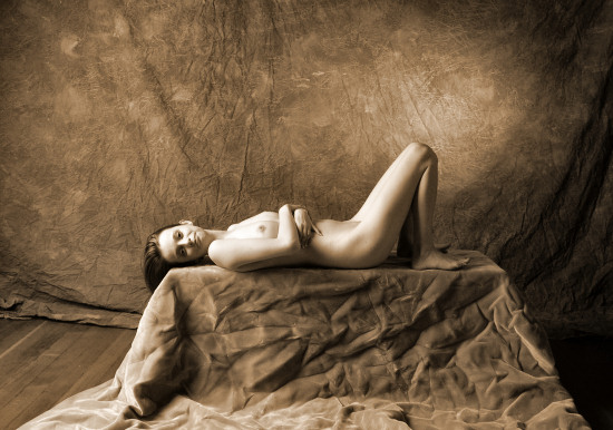
| See
-- here's after the minor lighting
adjustments. The background is a bit
lighter, and the spotlight on the back wall
(behind her knee) is more diffused.
Still, some more adjustments are needed, and
we work them out as we go along. And to
me, that's what these sittings are all about
-- getting started with a concept, and
refining it with small adjustments &
inspired ideas. |
|
|
|
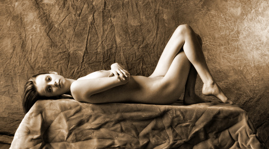
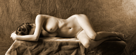
I
believe that I do my best work with models who
are sitting or standing -- I'm not as good
with horizontal models, so I like to work on
it whenever I get a chance. Here you'll
see some more adjustments from the previous
images on this page -- I'm closer, and for the
most part, I've cut down how much floor is in
the image. I like the light on Kristin's
face & the various textures. Still,
the image isn't quite horizontal, and that
back wall isn't exactly perpendicular to the
camera axis.
|
|
|
|
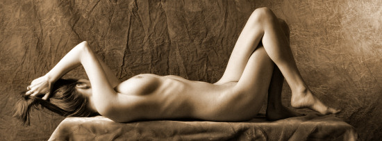
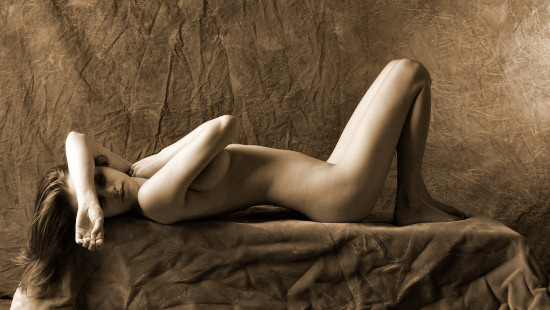
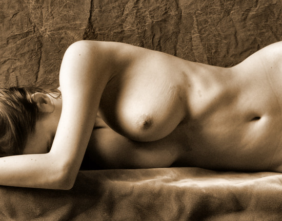
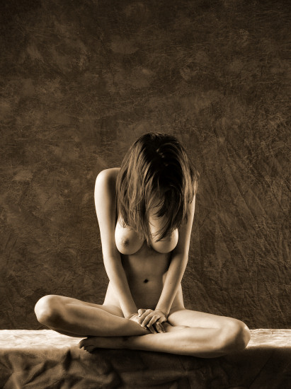
Still
making adjustments: I like the
non-standard cropping -- I do like images with
radical proportions, but only if the image
works.
One
interesting thing is that nudes without a face
are quite different from nude images that
include the face. Once a face is allowed
into the image, the image is most often a nude
portrait, but a nude image without a face is
more of an abstraction.
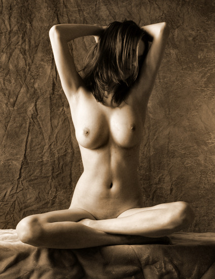
This
image is also rare for me -- there is no face,
but the entire nude image, from head to toe,
is included. I like this image.
|
|
|
|
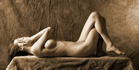
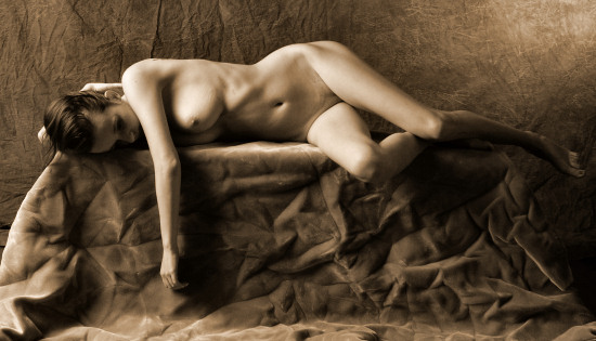
I
should have also mentioned that I like
Kristin's legs & hips, so I ask her not to
change that. However, she's free to move
her arms & head. I don't like this
image quite as much as the one above it --
there's something about her head & neck
that looks a little more strained to me.
Still, I'm liking the light. |
|
|
|
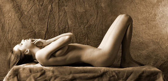
One
measure of the ability of a model is how well
she can move, find unusual shapes, and make
them look natural. Kristin does this
well. |
|
|
|
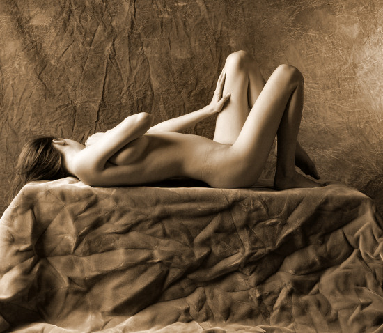
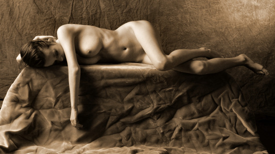
Just
for a break, I've cropped this image more
generously, including more of the bench under
Kristin. I guess I'm including this
image here for variety. Choosing a
cropping is one of my strengths, and when you
look at this loose cropping side-by-side with
the tighter cropping, I think you'll agree
that in this case, the tighter cropping is
more interesting. |
|
|
|
Now
I remember: during Kristin's
first visit, she had a cold, and when I
got her to lie down, she would wind up with a
coughing fit, so we didn't keep her on her
back for very long then. This time, she
was perfectly healthy, and she spent a good
amount of time on her back. Still, it
was time to move on, and I let her move around
more.
Many
photographers choose their cropping when they
compose their pictures. I don't.
My first camera was a viewfinder, and I was
never exactly sure where the edges of my image
were. So, I got in the habit of
including a little more than necessary in the
image when I made the exposure, and I would
crop the image during post-processing.
Most of the time, I would wind up using 95% of
the recorded image, but sometimes, I would see
just a small part of the image that was of
interest to me. This image is a case in
point -- below is an alternate cropping of the
same image -- which do you prefer? |
|
|
|
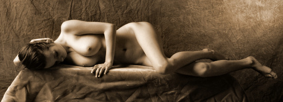
For
the most part, I'm enjoying the tight cropping
that includes Kristin's entire figure -- that
was working for me. But when she rolled
over onto her side, I asked her to dangle her
arm. This made a wider cropping
necessary, but that's good. This light
celebrates the textures, and Kristin's figure
is superb, too. One nit, though, is an
old posing nit of mine -- I don't like it when
a limb is pointing at the lens. Look at
Kristin's right thigh -- it is pointing almost
exactly towards the camera lens, which makes
her leg look a little stumpy. That's
what being a photographer is all about --
you've got to see everything, and you get to
see everything during post-processing, but
it's best for you to see everything during the
sitting, so that you can make adjustments as
you go along.
I
must have noticed this nit during the
sitting. Below is the next exposure, and
Kristin has changed the position of her
legs. |
|
|
|
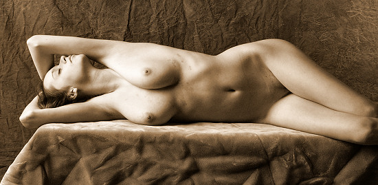
A
minor change to her left arm, and I can go
back to my preferred tight cropping. |
|
|
|
I
do like to have models stretch. One
note: normally, I like to set up a
concept & then explore all relevant
variations. I would have loved to have
Kristin to posed facing away from me, on her
side like this, so that I could photograph her
back, but Kristin has a tattoo on her shoulder
blade, and I have a definite, unshakable
policy against photographing tattoos.
So, we'll have to do without. |
|
|
I
didn't want to keep Kristin
horizontal for the whole
sitting, so I ask her to sit
up for a few more exposures.
|
|
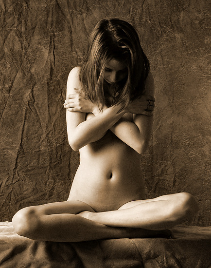
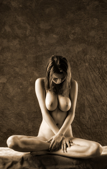
I usually ask models
to remove all jewelry, but for some reason, I didn't this time.
For this sitting, I've been quite aware of Kristin's hands, and we
keep her hands busy.
|
|
|
|
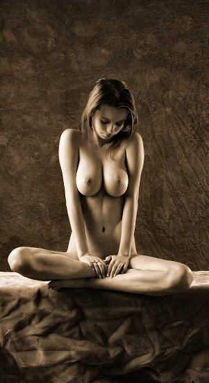
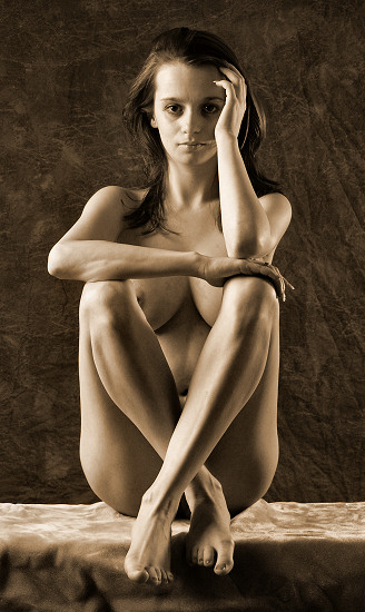
I'm
still playing with different
kinds of cropping -- here, I
include a lot of space at the
top of the image. Call
this a sitting favorite -- I
like the reflected light on
Kristin's face. The
image below is another
variation, but I think I like
this one (on the left) better.
|
|
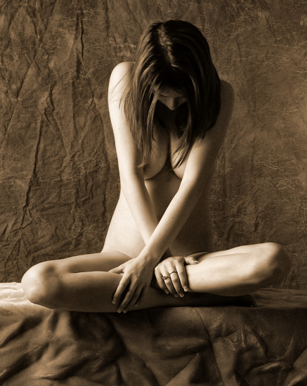
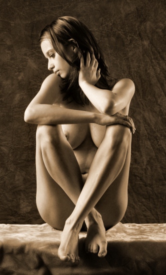
Another cropping
variation -- I like the proportions (narrow & tall), but this
time, I've included space both above & below the figure. I
couldn't tell you if I prefer the centered or off-centered figure, but
I suppose that if I must choose, I'd slightly prefer the centered
figure (this image).
|
|
|
|
I
like using this soft light, and
I seem to structure this kind of
light when Kristin poses for
me. She has such a curvy
figure, and the soft shadows
grant the image with a good
three-dimensional feel.
Kristin
excels at being comfortable
while posing nude. I've
only worked with her twice, but
both times, she exceeded my
expectations.
|
|
One last image from
this lighting setup.
As much as I like
this light, I think I want to push the lighting further. It's a
relatively simply thing to move the light stands a bit closer to the
back wall, but the impact is significant. Look at the results on
the next page.
|
|
|