|
Page
created April 16, 2005
Sitting done March 9, 2005
|
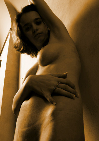
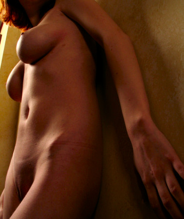
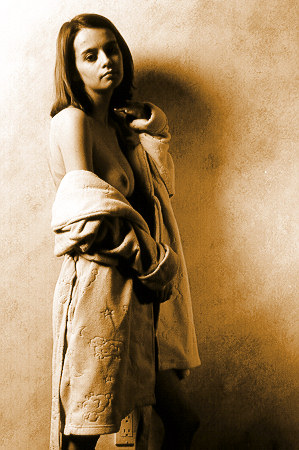
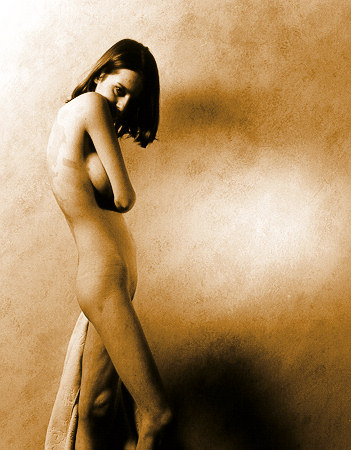
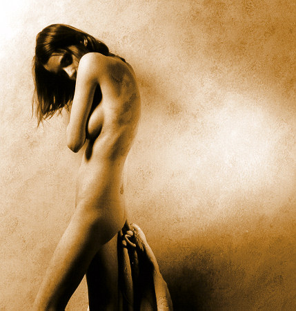
Now
that Kristin is nude, we do some work
against the living room wall.
|
|
|
|
Now
that the digital camera is
working, at least for the moment,
I take advantage of the pivoting
LCD screen to do some low angle
images. |
I
usually position myself &
the camera between the high
soft light and the model, but
this time, I move to the far
side of the model, creating a
shadowy
light. I love
looking at firm, flat bellies
(partially because I don't
have one). |
|
|
|
Perhaps
I shouldn't mention this, but I
will: Kristin wasn't feeling
100% well during this sitting; she
had the sniffles, and in certain
poses, she would have coughing
fits. At every opportunity,
she threw on this comfy terrycloth
robe, despite heating the room as
warm as possible. As it turns out, I
like photographing her in &
out of this robe.
The
concept was to have a main light
to the model's right side.
Normally, this would cast a large
shadow on the model's left side,
and I dislike single light source
images, where the model's off side
is in shadow in front of a
background shadow. In the
past, I've been known to add a
second light to highlight the
model's off side, but when I
recently photographed Lydia, I
threw the light onto the wall
& let her off side be in
shadow. I decided to build
on this concept.
Here's
the first exposure, and I found
that the wall light was too
bright. (That's
the advantage of using the digital
camera, checking the lights).
After this, I reduce that light's
brightness and get to work. |
To
a small degree, my old strobe
power pack allowed me to vary
the power to the second strobe
head. A simpler solution
is to move the strobe head
away from its target.
That's what we do.
Much
better! I like how the
off side wall light is
balanced with the side lit by
the main light; I like how the
light bounces off the wall to
highlight Kristin's
shape. I like how the
shadow on the bottom right
corner of the image anchors the
image, and I like how the
soft, soft main light from the
extra large soft box looks on
Kristin's face & figure.
The muted colors are a bonus. |
|
|
|
Here's
a film-based image. I still
like the tonality I can achieve
with film.
I'm
falling in love with this
lighting. We make lots of
exposures. |
|
|
|
|
This
is the same image with two
different croppings. My
very first camera was a rangefinder,
which meant that my viewfinder
didn't always accurately
represent the edges of the
exposed image. So, I got
in the habit of stepping back a
few inches & cropping all
the pictures. I don't mind
cropping -- several
photographers take pride in
using all their negative, even
including some of the negative
frame in their prints. Not
me -- I am happy to crop images
for the best composition.
Which
do you like the best? Me
-- I like the one on the
right. I think the line
caused by the dark baseboard
distracting. |
|
|
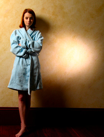
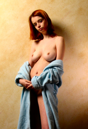
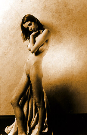
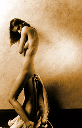
Okay,
now I'm thinking about the
baseboard. Also, using a light
colored wall tends to present some
challenges, particularly with
reflected light. So, I decide to
put up my favorite backdrop, and we
wind up with some of the best light
I've been able to craft ever.
This
sitting continues with Old
Master Painter Light
|
(Remember -- feedback is always
appreciated)
| All
images (c)
2005 Looknsee Photography |
|

|
More
images from this sitting are available in the Out
Takes Galleries. These galleries are available to
those who have made a donation
to the upkeep of this web site. See this
FAQ question for more details.
There are 70 more images in the Out Takes
Gallery
|
|
|
|